Objective
To create a frictionless sign-up experience and design a more visually appealing and approachable page.
Background
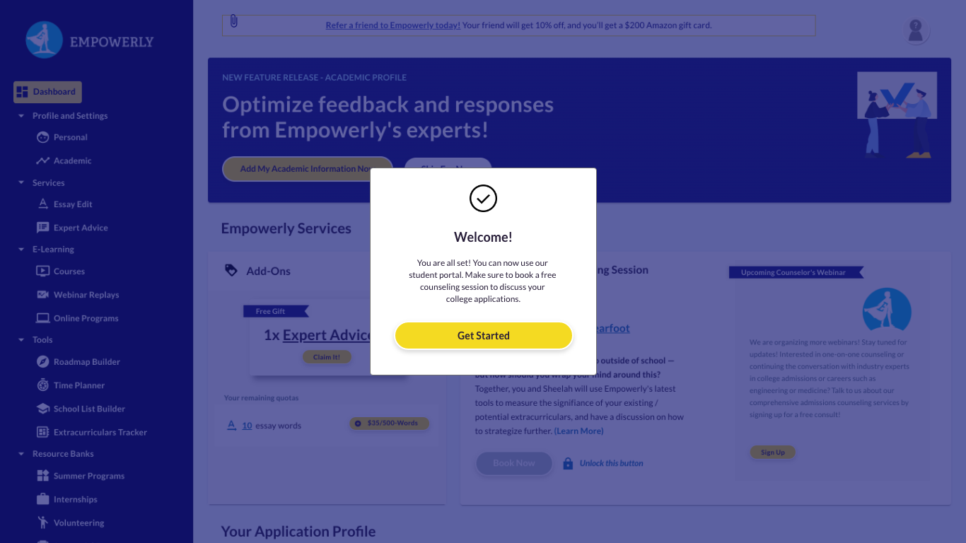
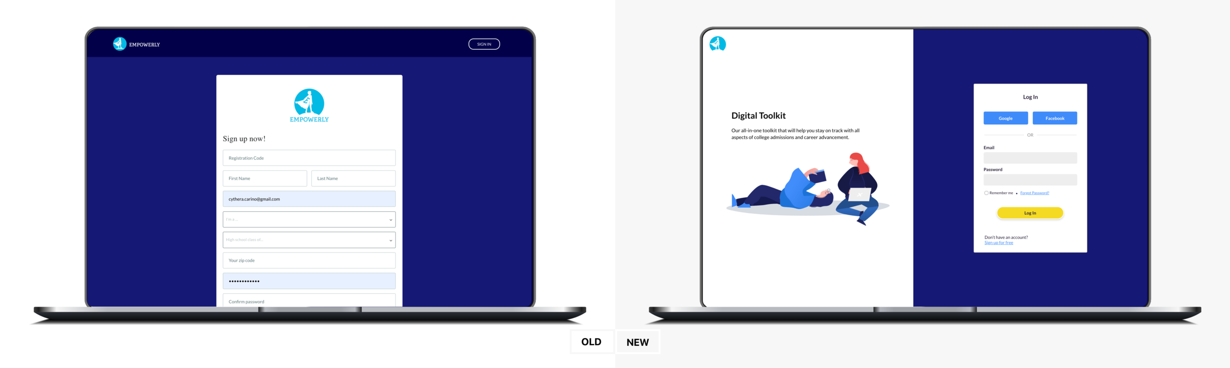
With the successful redesign of the student portal, we were excited to know that users were signing up for our free student portal. Although we saw an increase in user signups, we discovered a huge percentage would end their journey once they complete the email confirmation and would not log in to explore the student portal. Along with the signup issue, the page is visually inconsistent with the redesign and still obtains its prehistoric look.
Goal
Identify the current flow and user behavior on how customers find and signup for our student portal. Analyze the existing data and find gaps/friction between the Marketing website and the signup flow/student portal.
Project Responsibilities: User Interviews & Research; User flows; Wireframes & High Fidelity Mockups, Illustrations
User Research
Conducted qualitative and quantitative research by observing how real users interact with your product and discovering the issues that prevent them from thoroughly enjoying the experience and signing up. Collaborated with the Product Manager and Engineers to understand design constraints.
For the full Empowerly Sign-up Research Analysis, you can click here.
Discovery
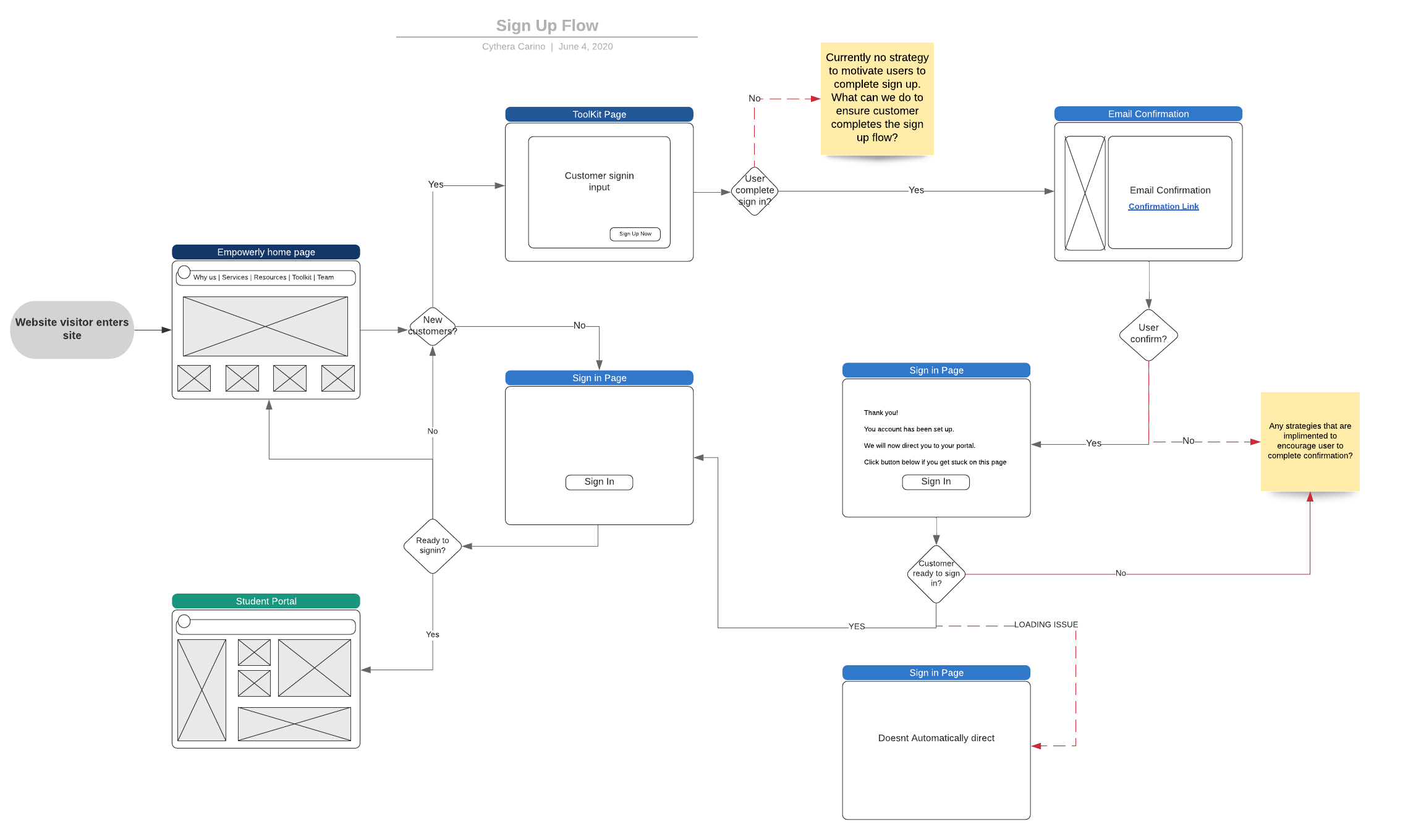
It was crucial to understand if our users are aware and understand what they are signing up for and also uncovering any friction or UX inconsistencies during our signup flow/process.
Insights:
Although the sign up is relatively easy, users tend to be confused about what they are signing up for. The inconsistencies regarding the copy of our student portal - Toolkit vs. student portal.
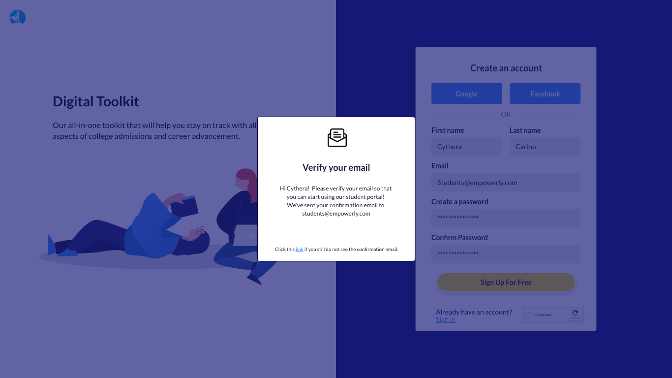
"We will now direct you to your portal" but portal does not load which causes delay and confuse users.
Logging back in after validating and inputting email and password is a friction that we should look into. Logging to email after signing up causes another — e.g. one user briefly forgot her password.
Current Userflow + Friction
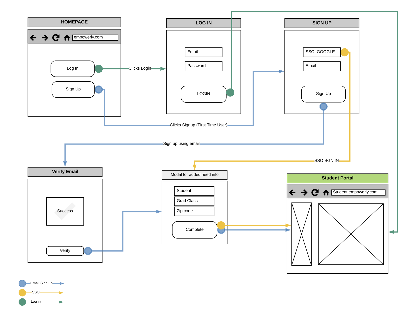
New suggested Signup flow
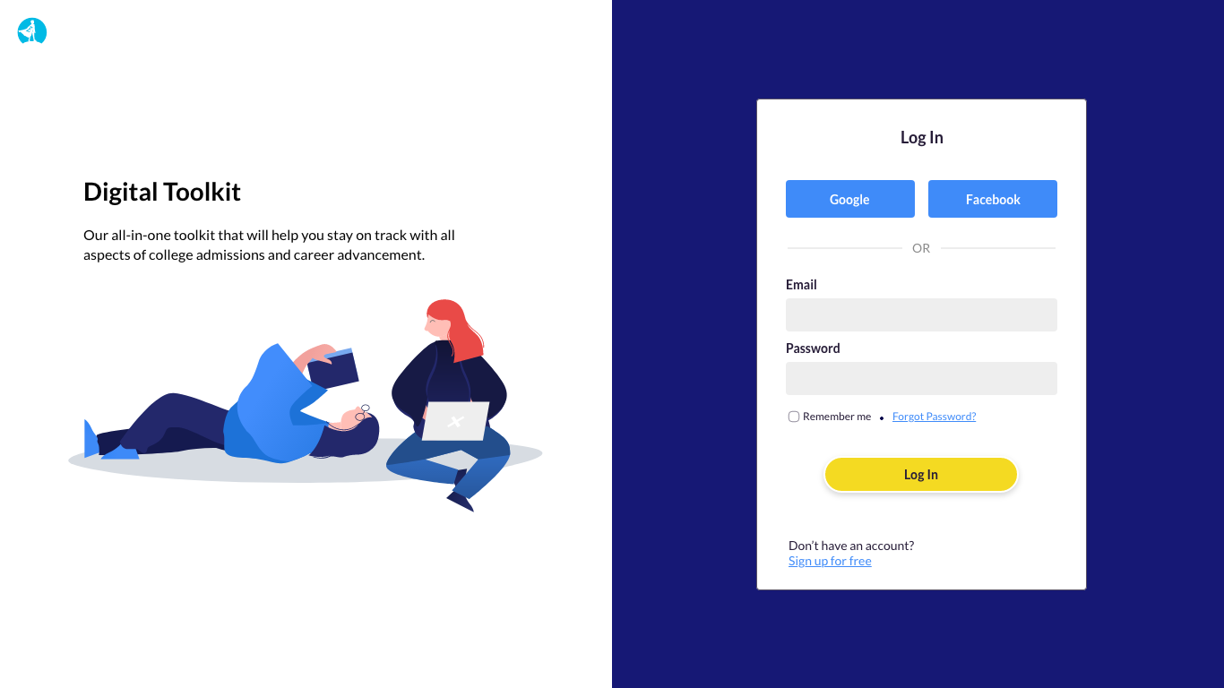
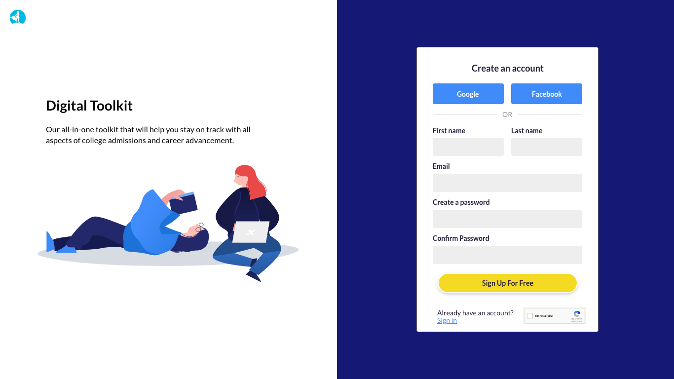
Solution
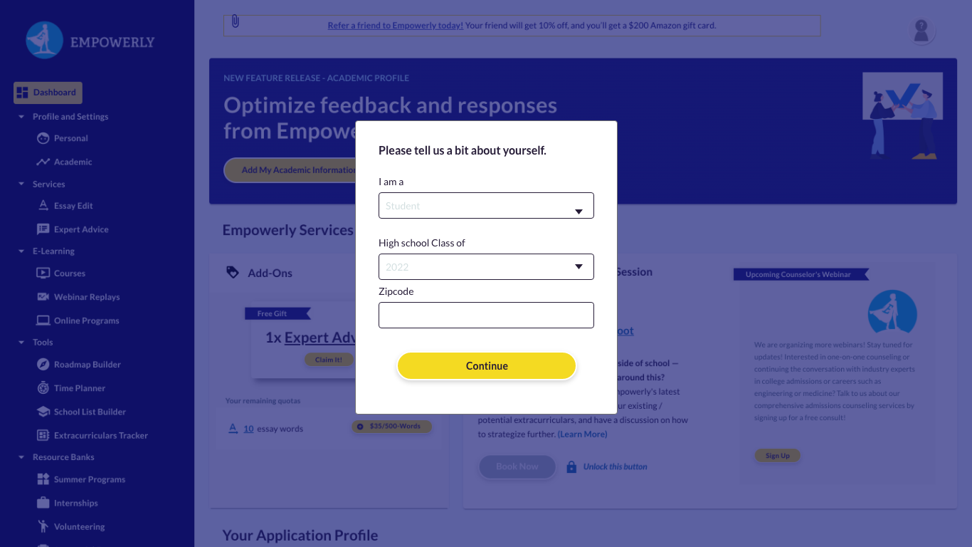
To make it easier for our users, we introduced social media signup. Giving the option to sign up using Gmail or Facebook should promote a more straightforward approach to signing up and logging in. To create a more welcoming and appealing presence, I added illustrations and short information about the student portal and its offerings. This will provide our users with a clear idea of what they are signing up for and its services. Currently, the form is quite long and asks users for additional information; I decided to ask the added information after they sign up. By asking minimum information, users will not feel overwhelmed by them and can create an efficient experience.