LUPA
It's 6 PM on a Wednesday in the first week of September, and I'm sitting inside a coffee shop using a paper straw for my coffee. With San Francisco recently banning the use of plastic straws, I felt that we as a society are heading in the right direction and embracing more environmentally friendly practices. But it made me wonder, how are we personally contributing to better our environment, or are we even at all?
PROBLEM
Educating future generations about the causes and effects of global climate change is imperative since implementing solutions depends on an informed public. How might we help users find a way to learn, take action, and see the results of their efforts in an intuitive and impactful way.
SOLUTION
Lupa is a mobile app for users to take action and find resources to educate themselves about our environment. The mission is to let users know that helping the environment doesn't involve significant changes in your lifestyles and small changes do make an impact. The challenge for me when designing Lupa is how not to let my users feel overwhelmed when learning and acting on such a severe and vast topic such as climate change. How might we make sure the experience is fun, motivating, rewarding, and impactful?
MY DESIGN PROCESS
UX DESIGN
User Interview
Personas
User Story creation
Task Flow / User Flow
Wireframes
UI DESIGN
Moodboard
Styleguide
Visual Design
Mockups
Testing
Usability Testing
DISCOVERY


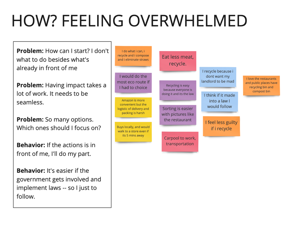
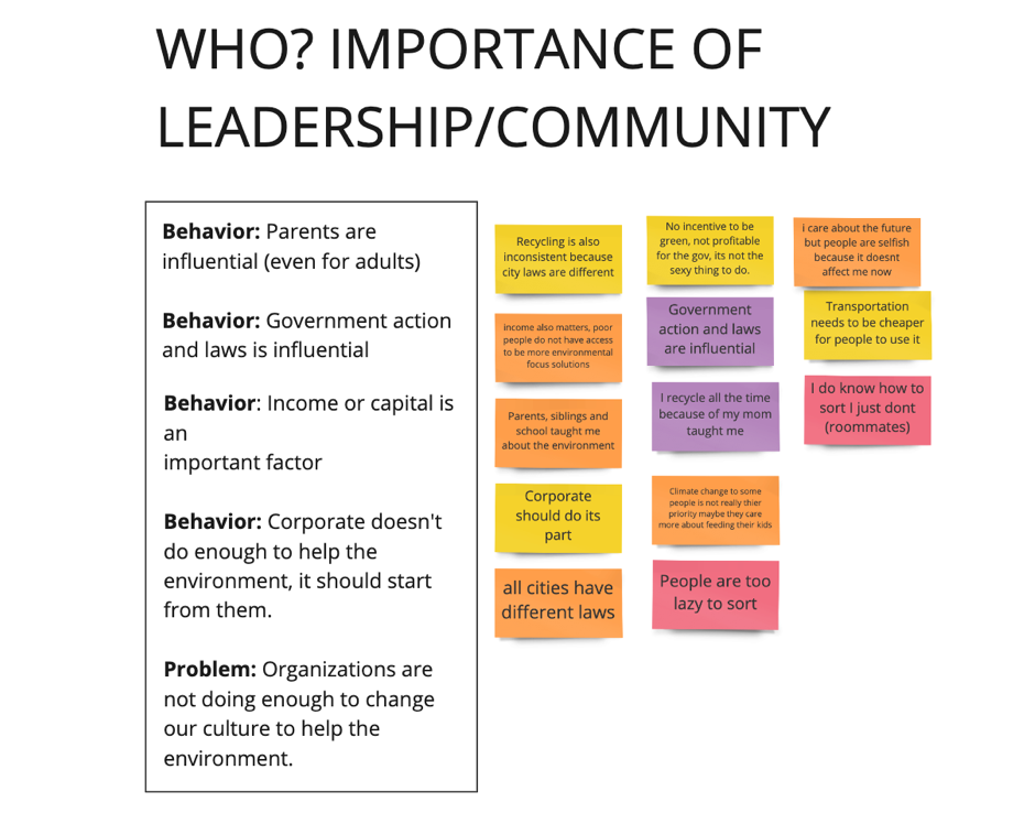
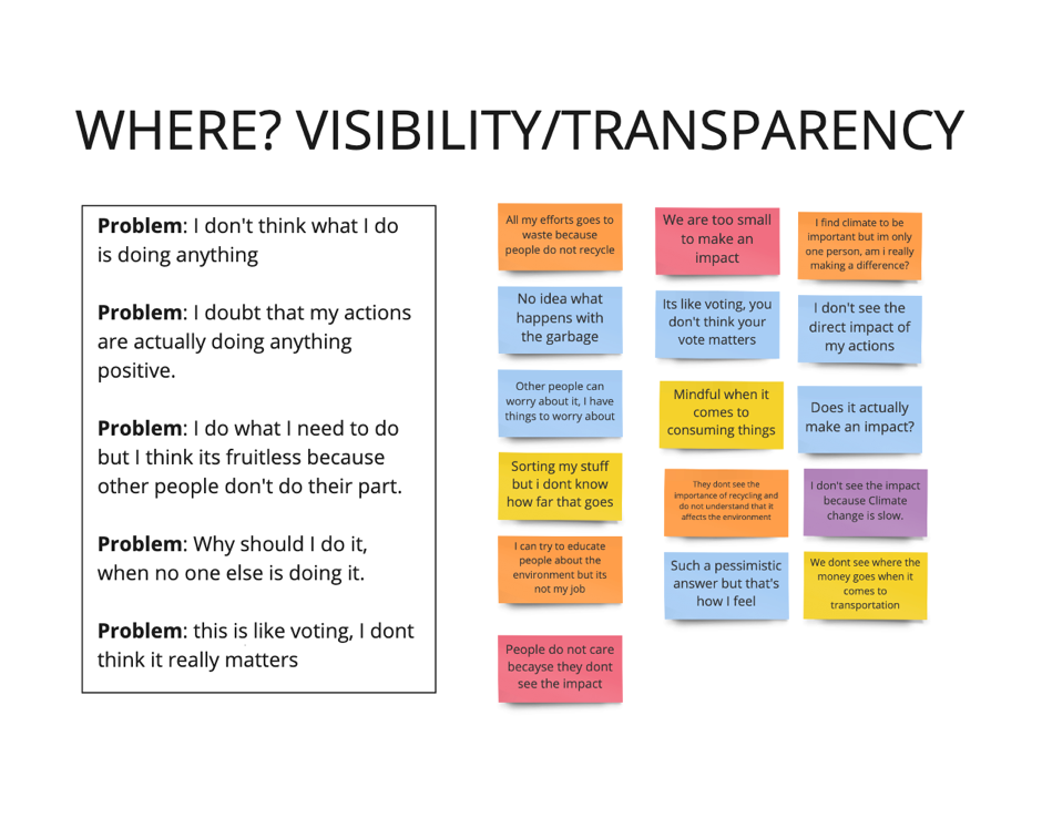

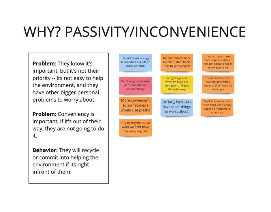
FINDINGS:
"I believe Climate Change is important, but I doubt that my actions are actually doing anything positive, " one interview participant said.
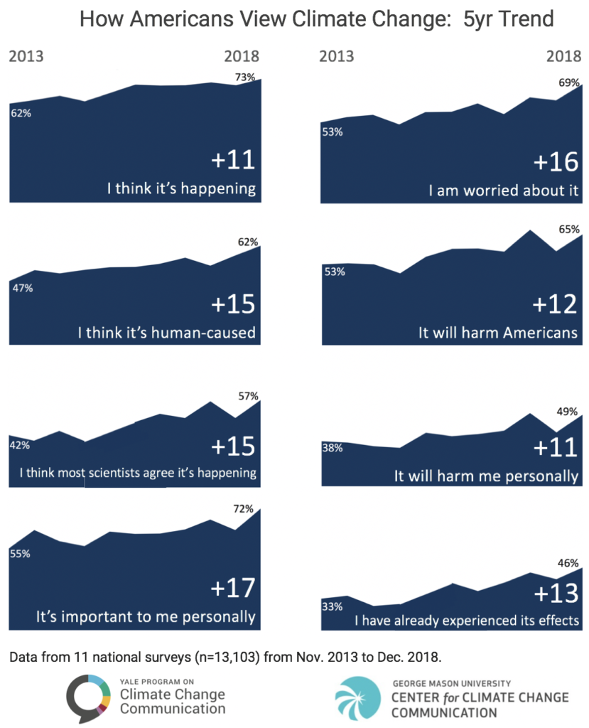
This statement was consistent with the data results, which showed that though Americans are increasingly worried about climate change, fewer than 4 in 10 say they believe that tackling the problem will require them to make "major sacrifices." And most are unwilling to pay for it out of their own pockets.
As I did a competitive analysis, I also realized that each product did not produce a rewarding experience for the users. Although each app provided users their carbon footprint estimations, it lacked explanation on what those numbers signify.
These insight shaped my goals for the product.
My goals were:
Make it fun and rewarding for users
Give users more control over what they want to learn and what actions they want to try.
Create a platform that has high-quality resources but still digestible or relatable for everyone.
IDEATION
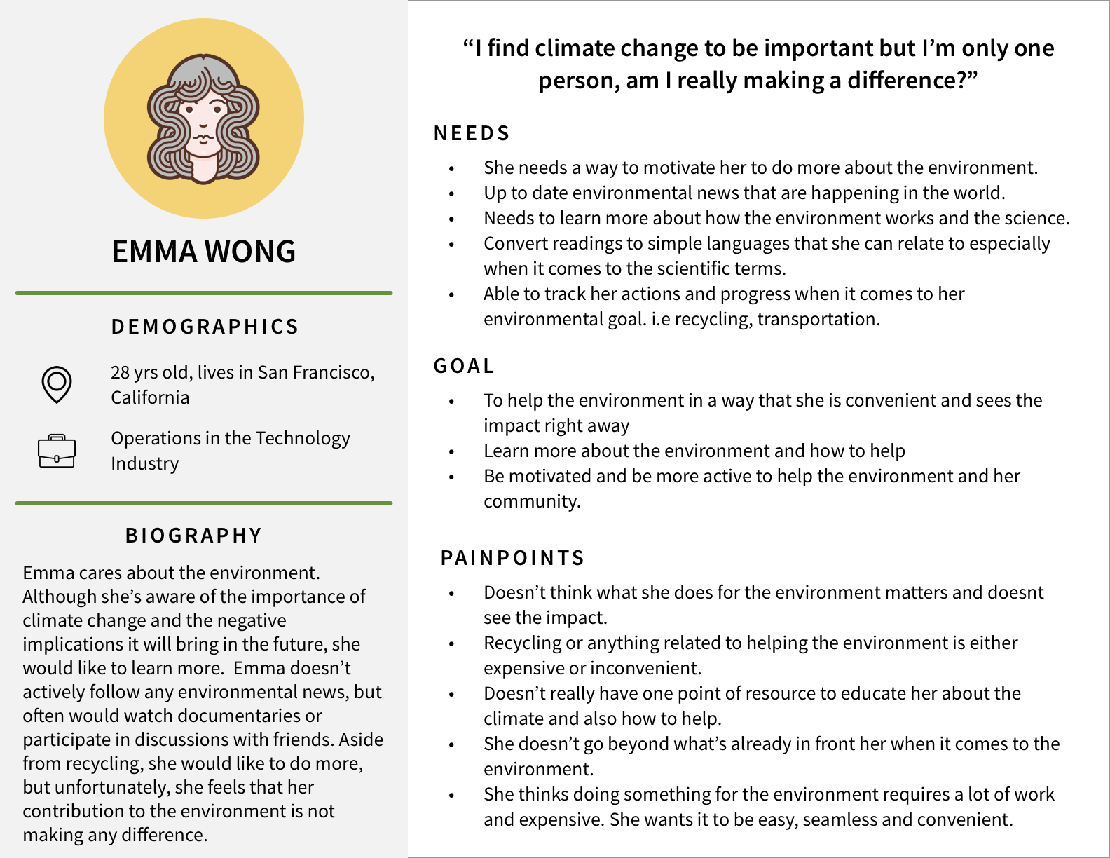
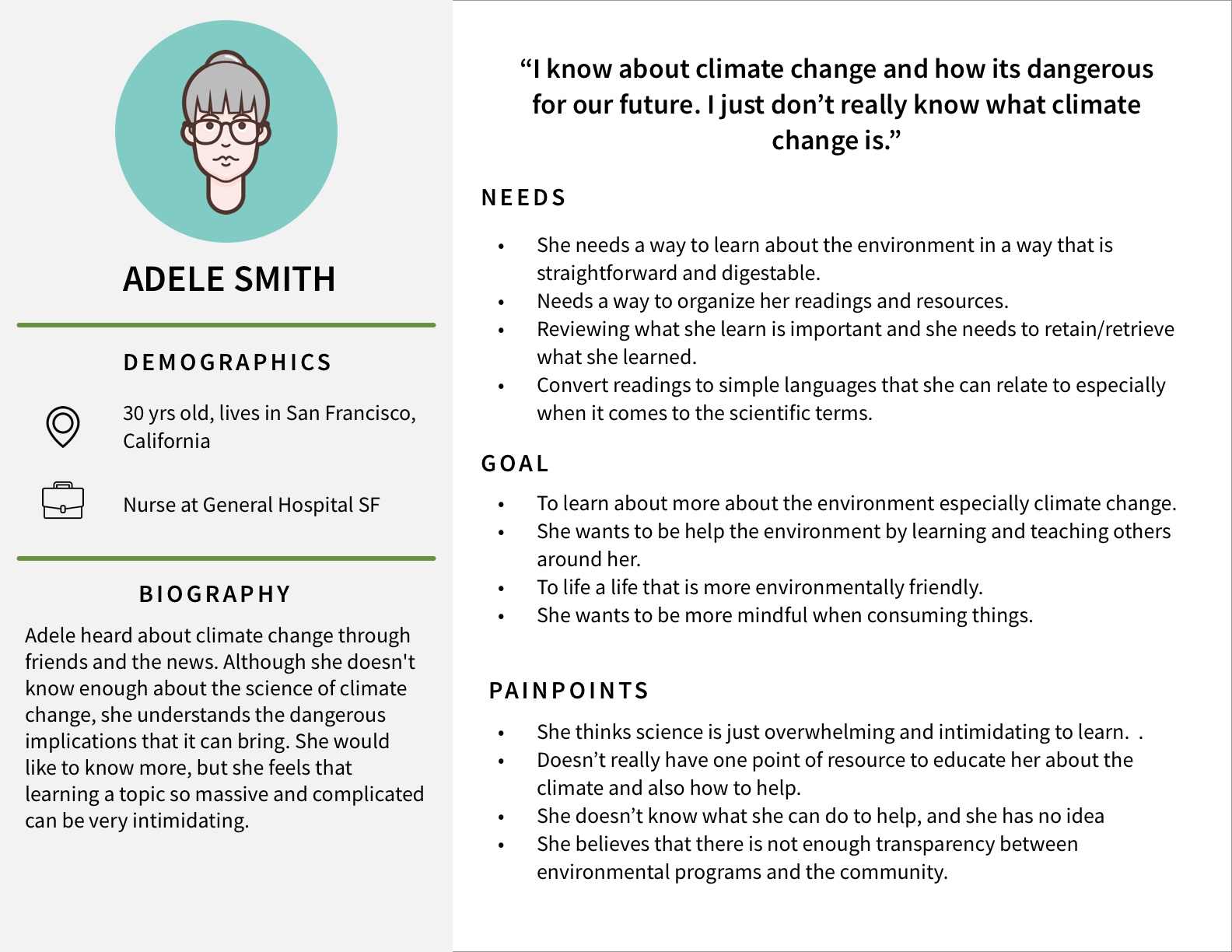
PERSONA
From all the data I gathered, I discovered two personas that will help me align my strategies and identify goals that I need to provide a good UX for my target group.
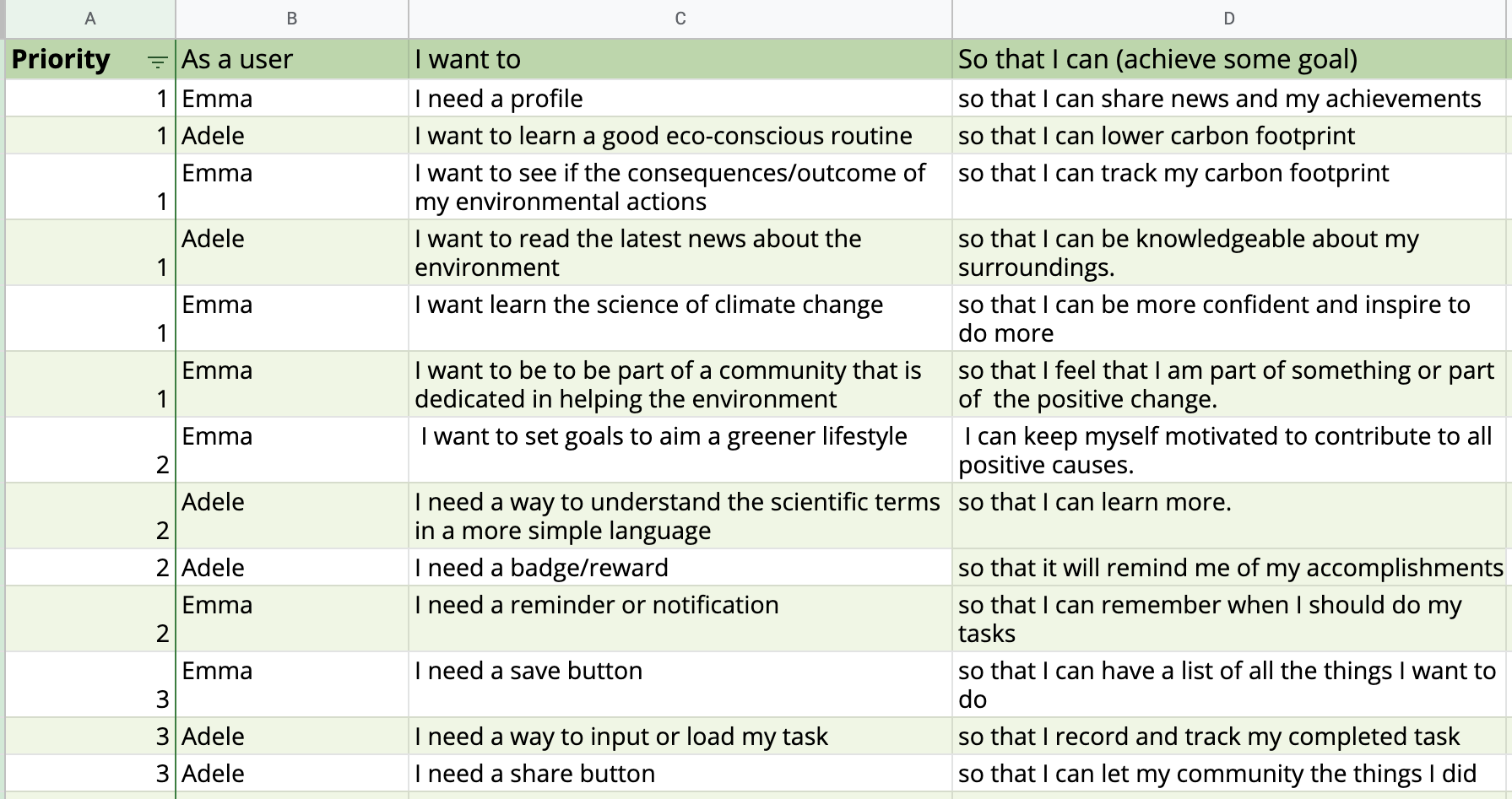
USER STORIES
By using my persona on my user story, I was able to focus on the functionality of the app while delivering value and catering to all their needs.
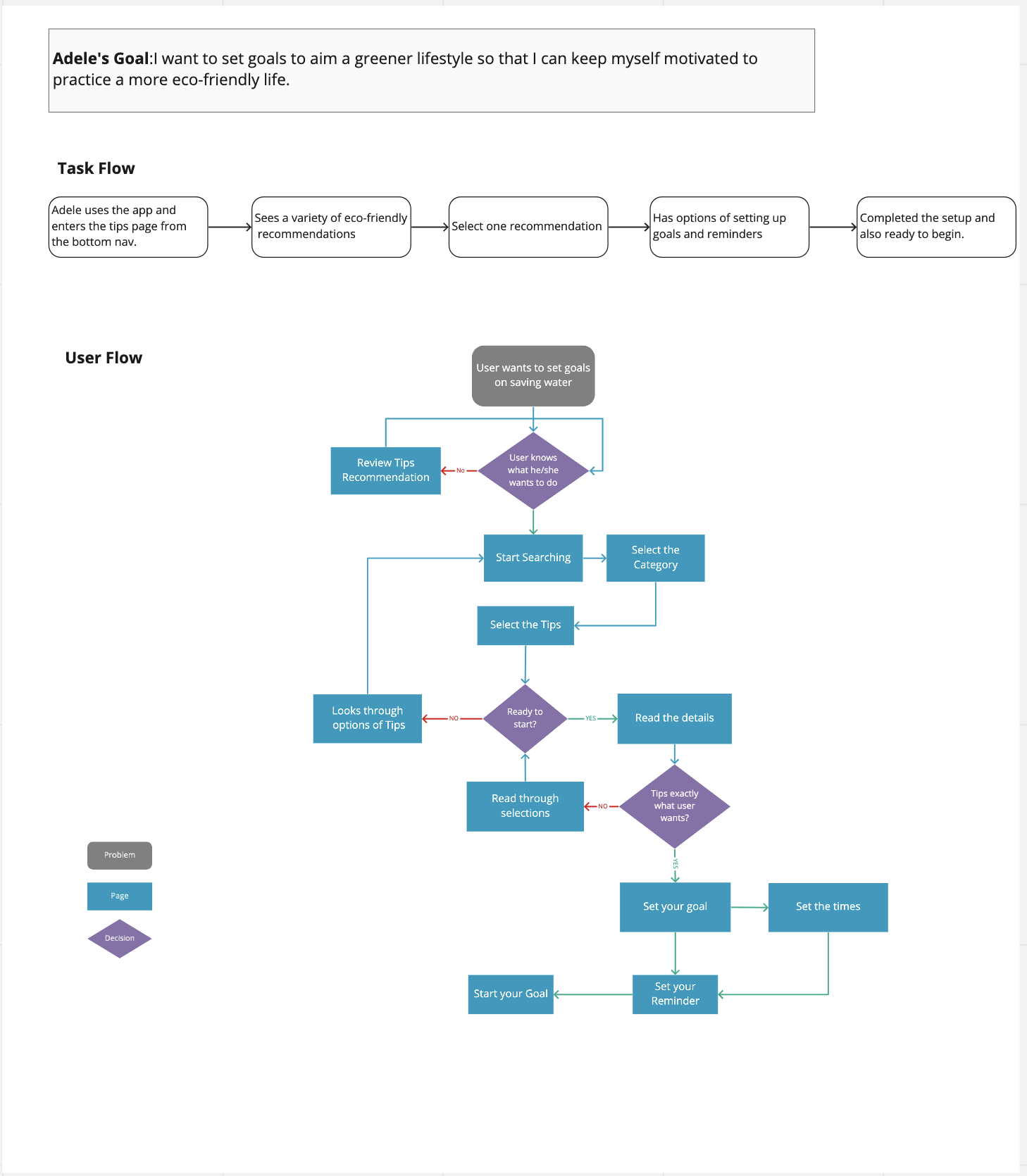
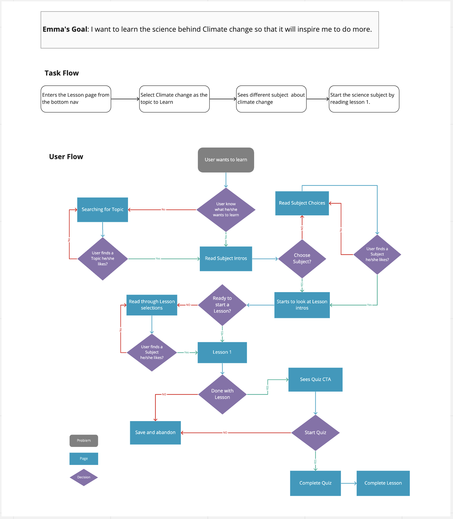
USERFLOW
I wanted to evaluate how my Emma and Adele were going to complete specific goals. By understanding how my personas were going interact with the system and how the app will react to their actions, I was able to plan necessary decision point where Emma and Adele have to make a choice.
SKETCH
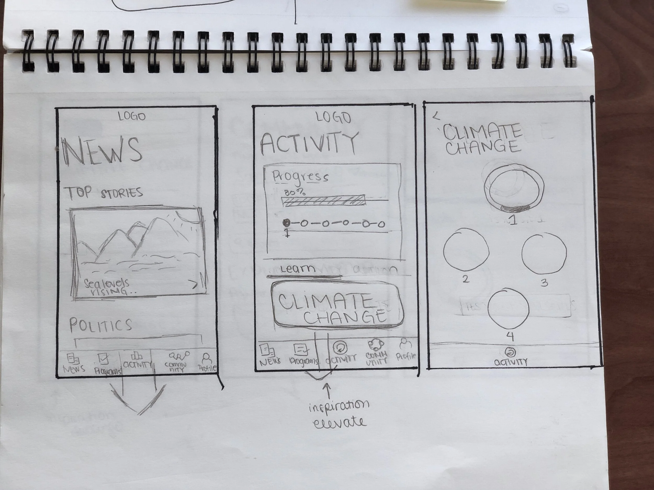

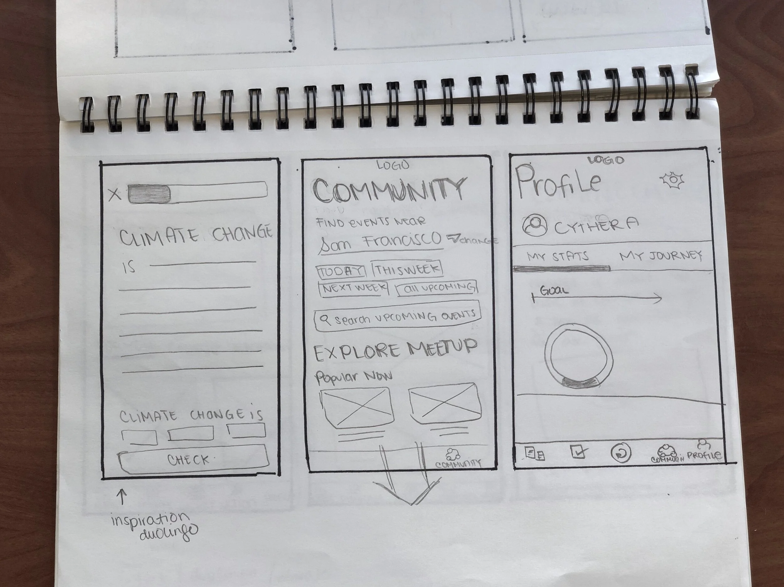
WIREFRAMES
GUERILLA TESTING
Most of the users understood the flow of the mobile app. The key insights that I gathered during the usability test were that the Page Title was confusing to the users and inputting a day on the activity summary was not as intuitive as I thought.
Content: 2 users mentioned that they were unsure with the word 'Courses' and 'Comparison of yearly similarities impact.' They felt the word courses reminded them of school while the word "Comparison of yearly similarities impact" was just too confusing to understand what the goal was.
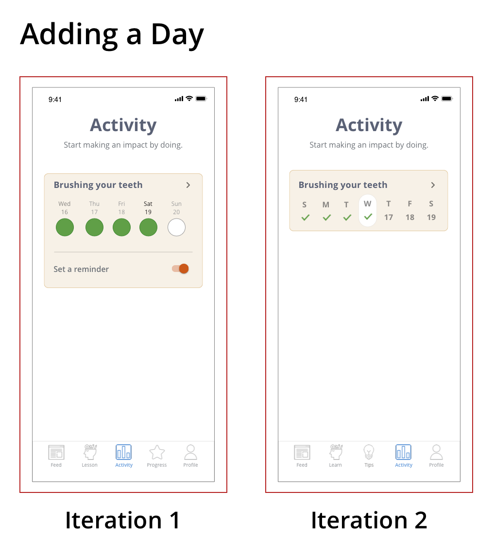
Adding activity: Adding the day on the activity summary confused the users. I’m not sure if the wireframes were the reason for the confusion. I will be revisiting this task when I create my hifi prototype.
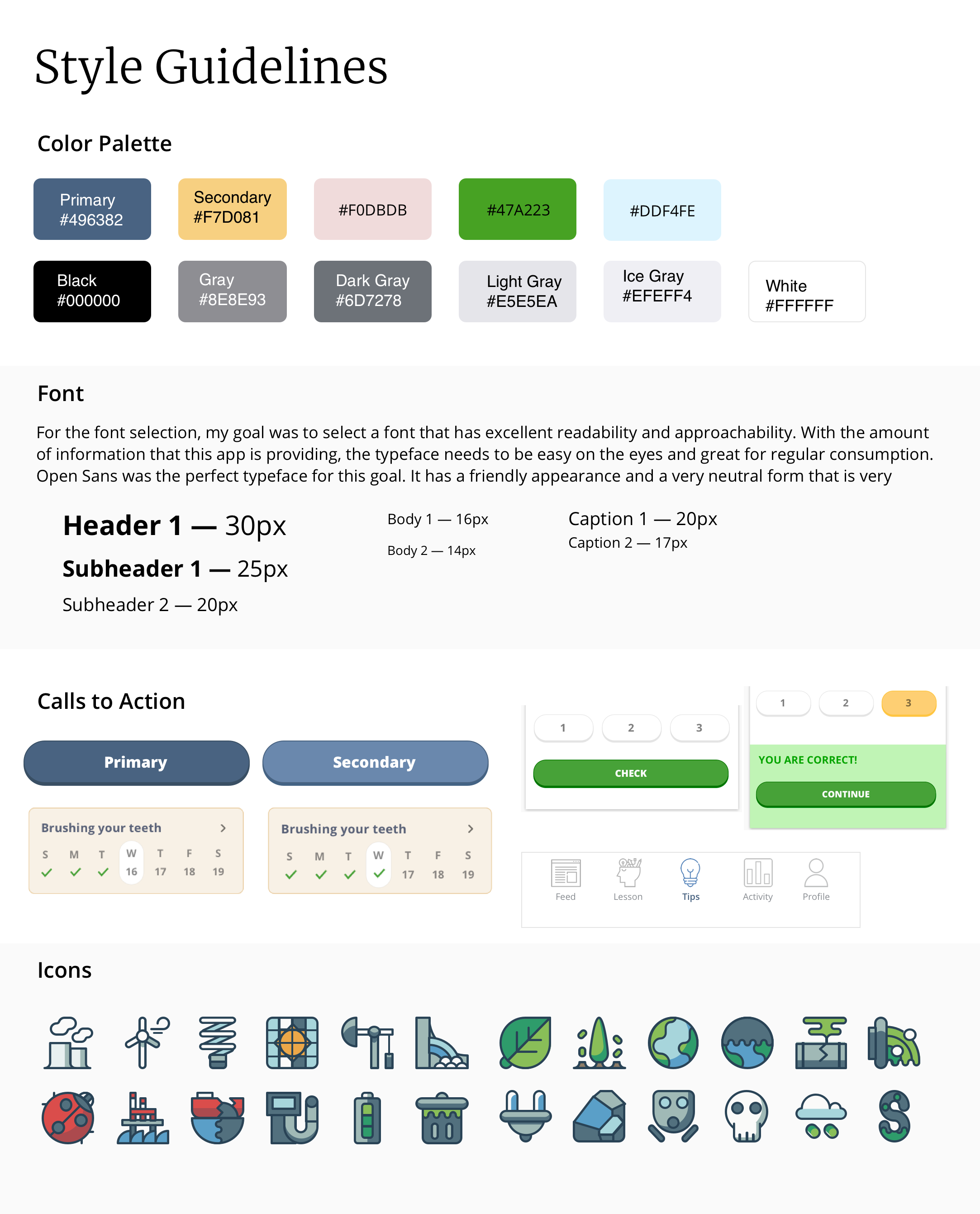
VISUAL DESIGN + UI
Mood Board & Tone
Focus on Readability. Importance use of big fonts, bright colors, and right font. Due to a lot of text required for the app, text, and titles needs to be clear and simple.
Illustrations: Having illustrations will make the app for lively and appealing. With all the heavy information that the app provides, illustrations will be a great balance to uplift the product.
Use of Cards for organization: There is a lot of information presented, so the use of cohesive and straightforward cards are essential to organize the information. This visual organization is an effective method to separate different topics/functions. Also, cards give users the accessibility to control their selections.
TESTING
PROTOTYPE
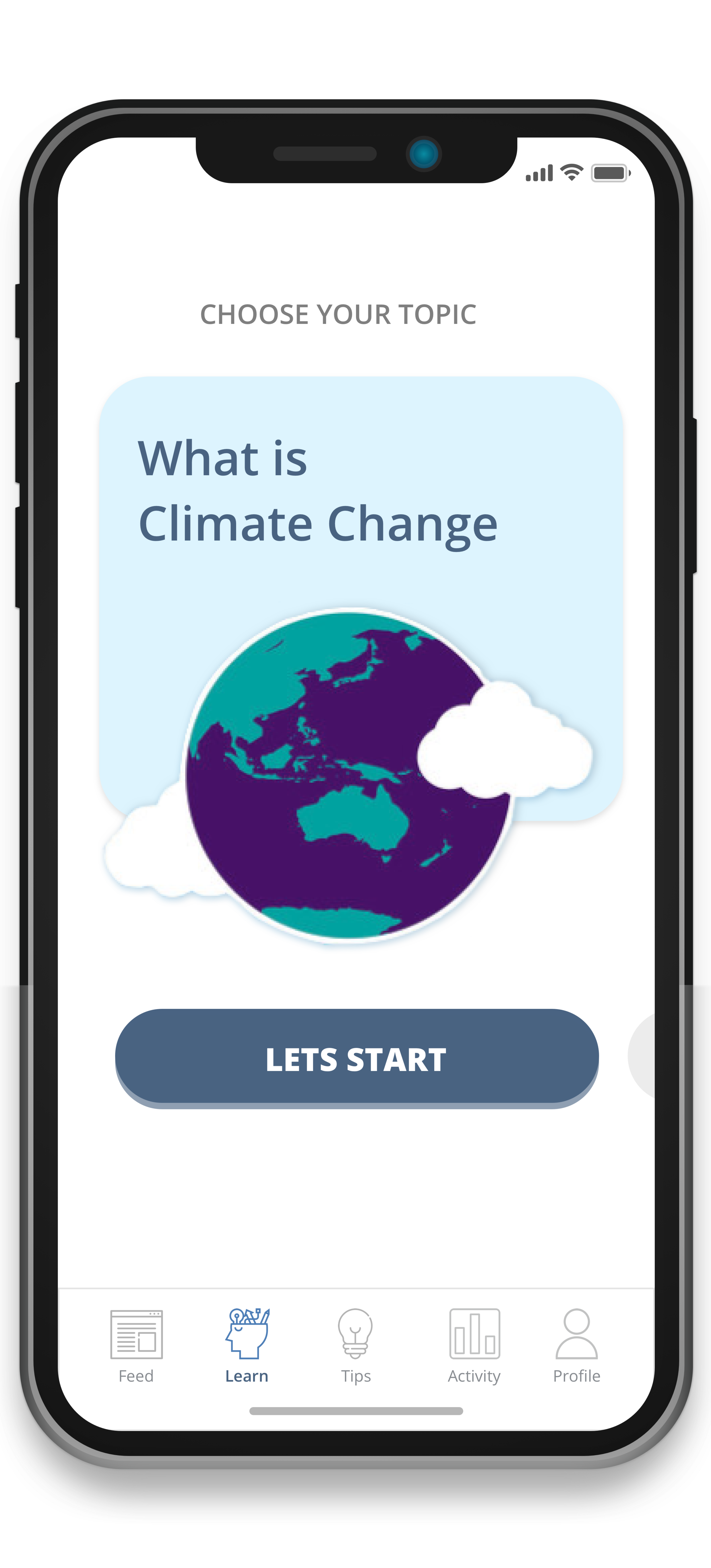
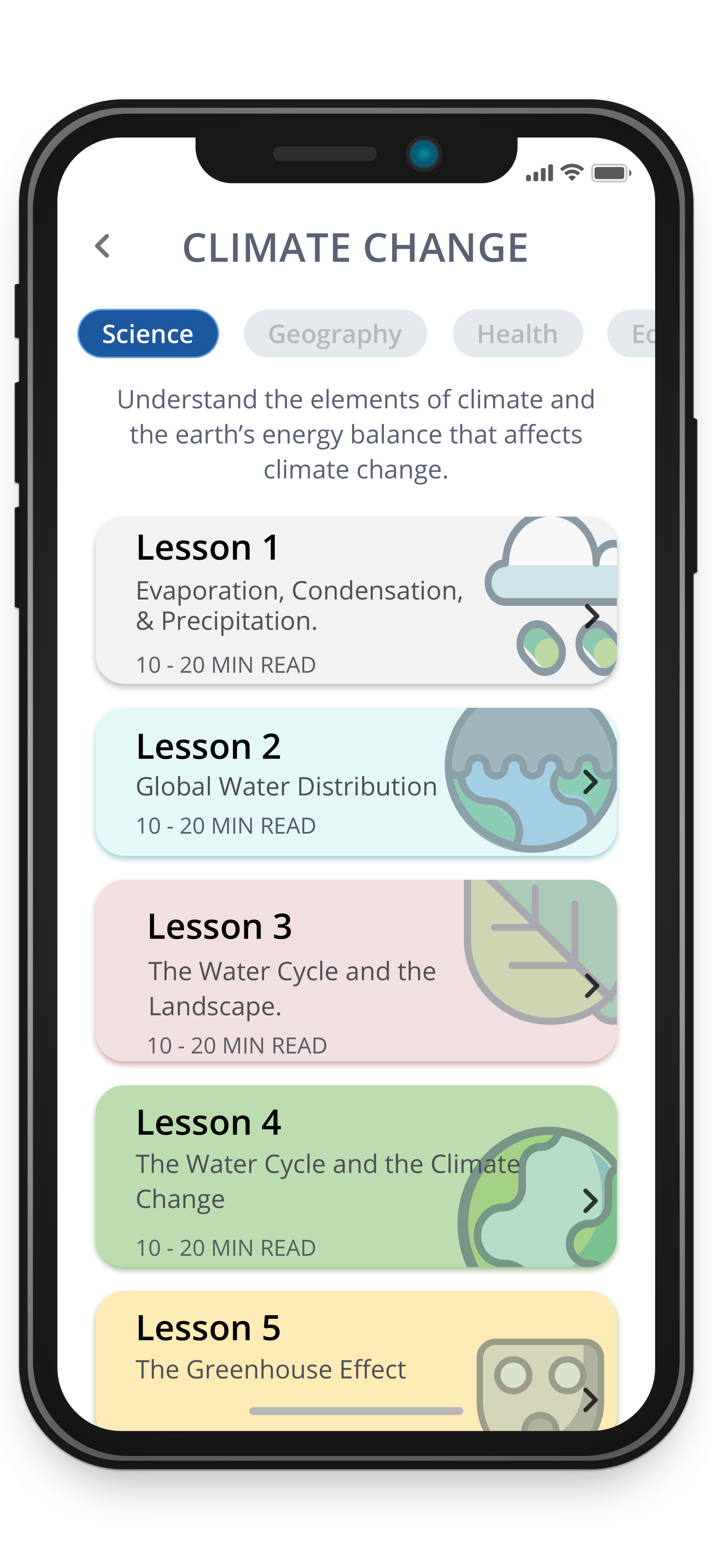
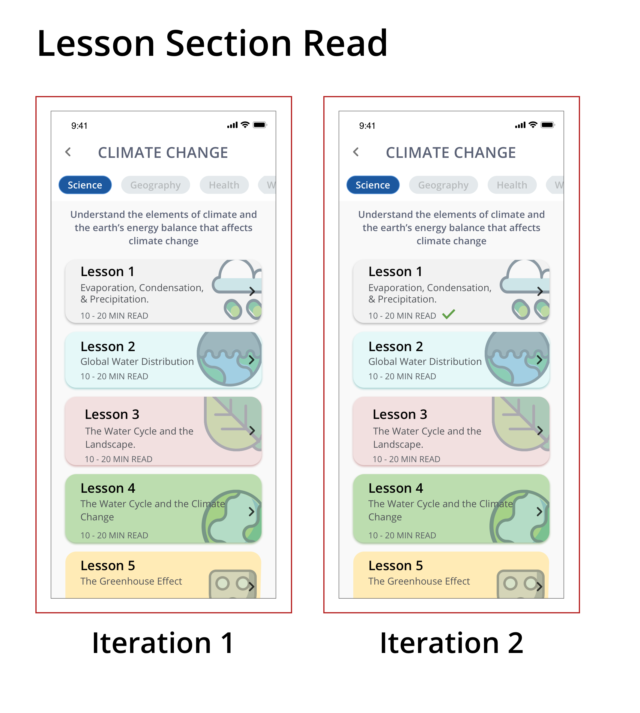
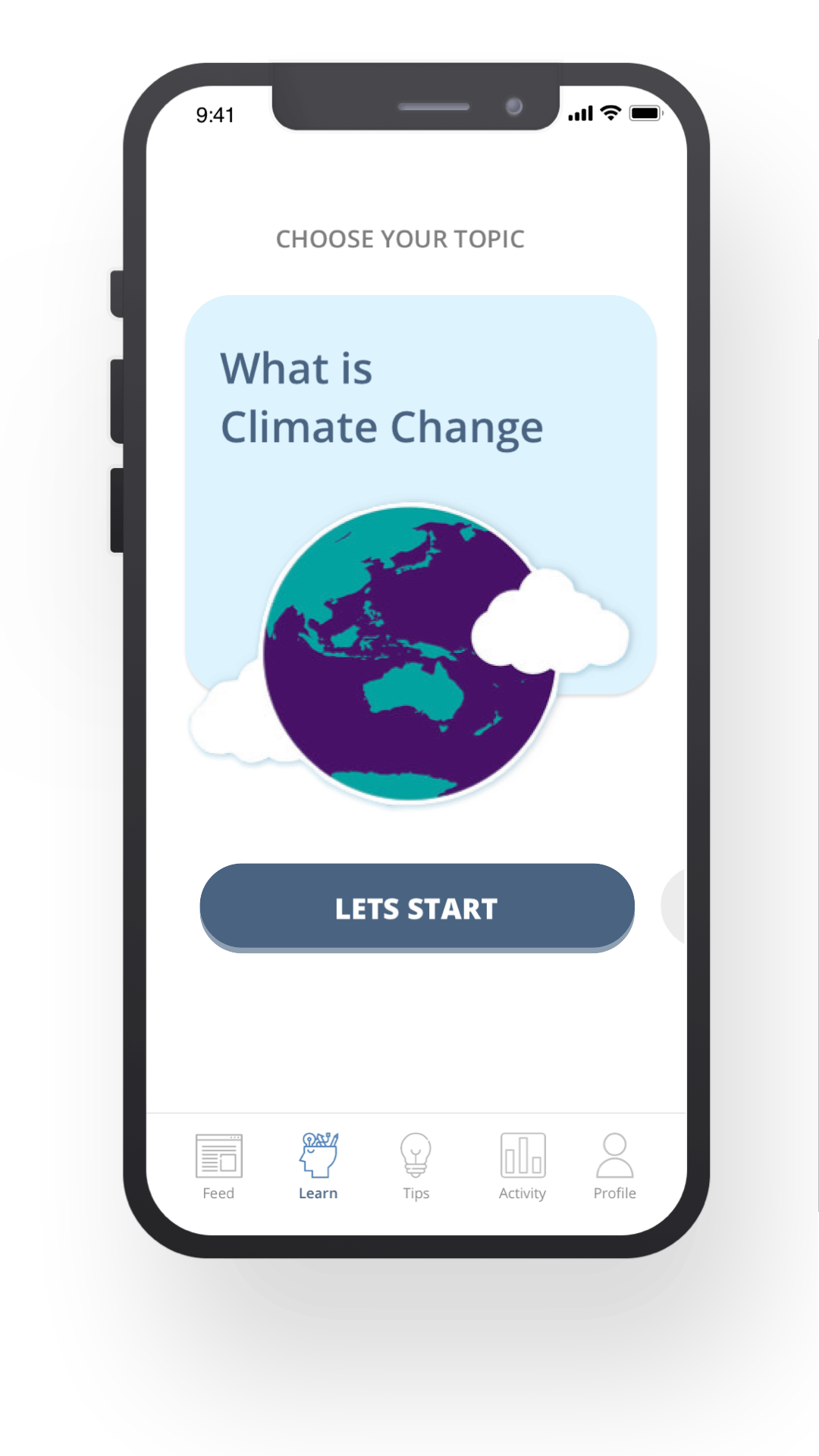
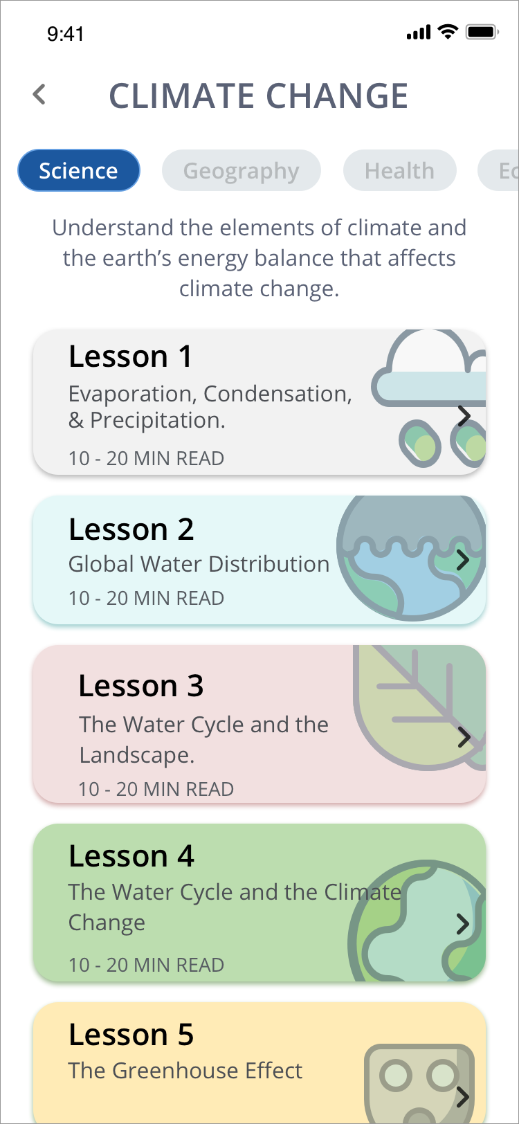
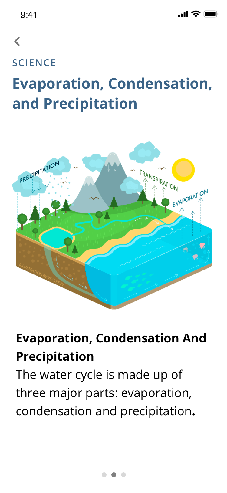
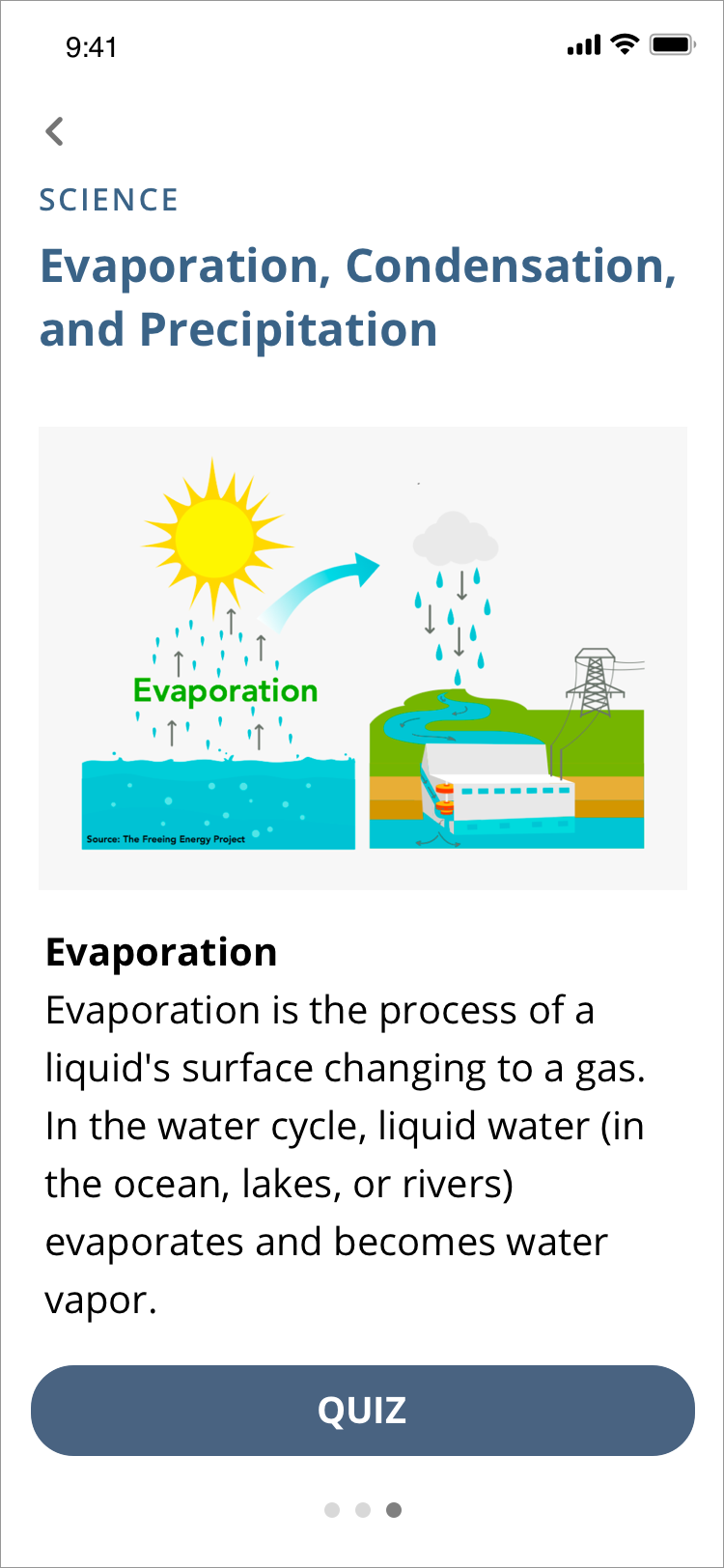
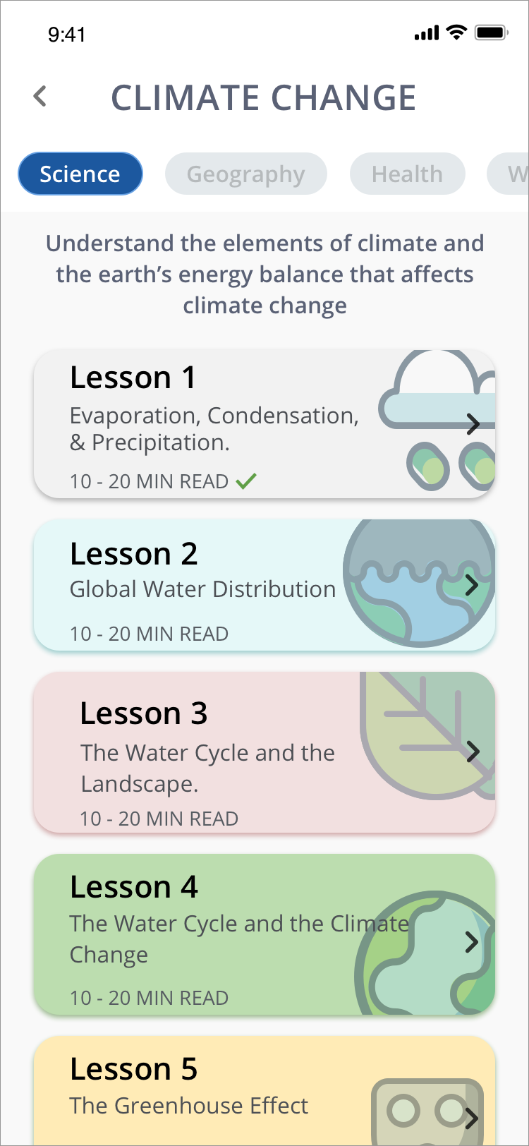
Group 1— Education: This section is for users to be able to learn about Climate Change. The curriculum is organized by lessons to reduce cognitive load and not to overwhelm the users.
Group 2 — Comprehension: Understanding a complicated subject can be intimidating. So to create a better experience for our user and provide understandable materials, all contents are at a Grade 8 reading comprehension level. To also improve comprehension and retrieval of information, I included visuals/illustrations to support the user.
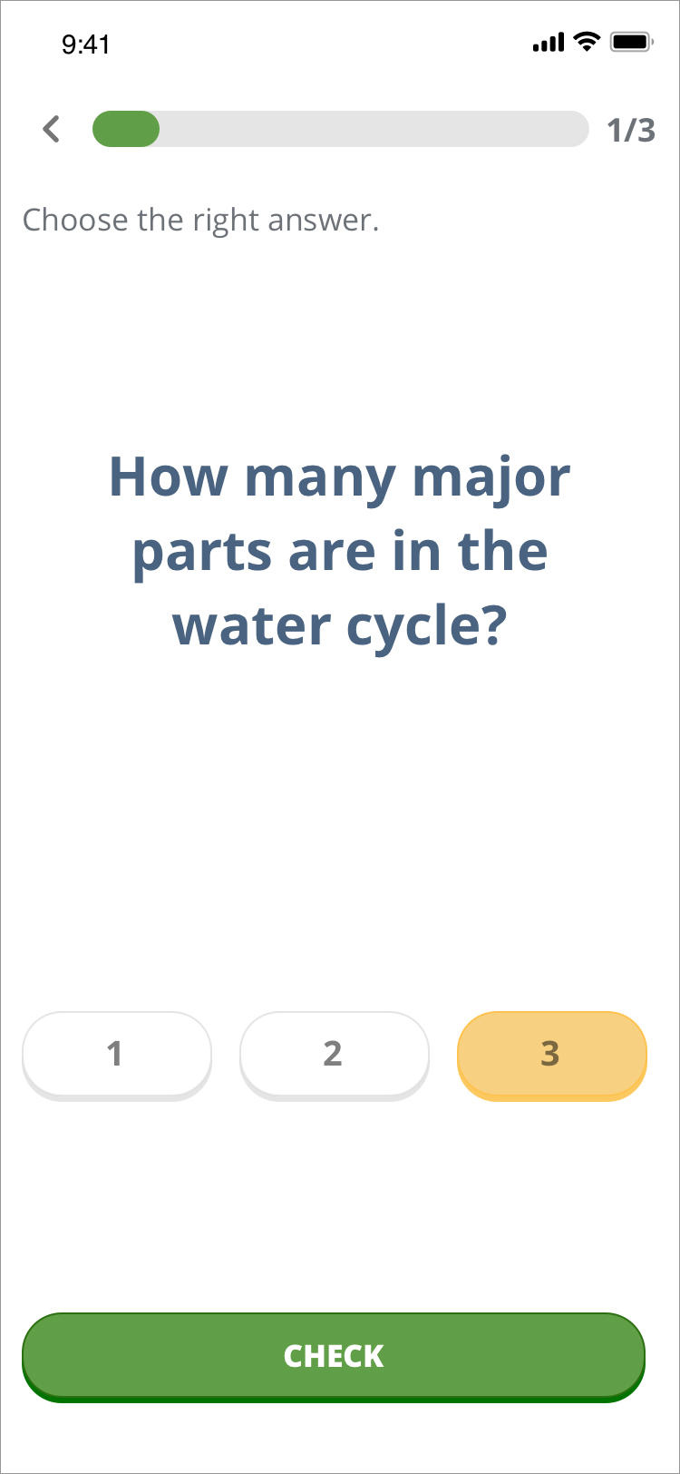
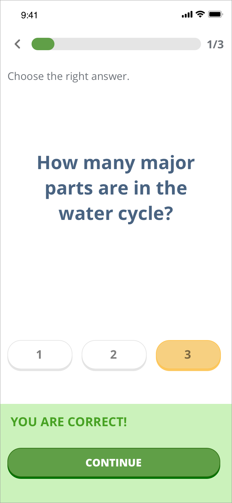
Group 3 — Retention: Repetition is an essential element of learning, and one way to repeat content is through quizzes. The purpose is not to assess learning but to give learners a way to remember what they have learned.
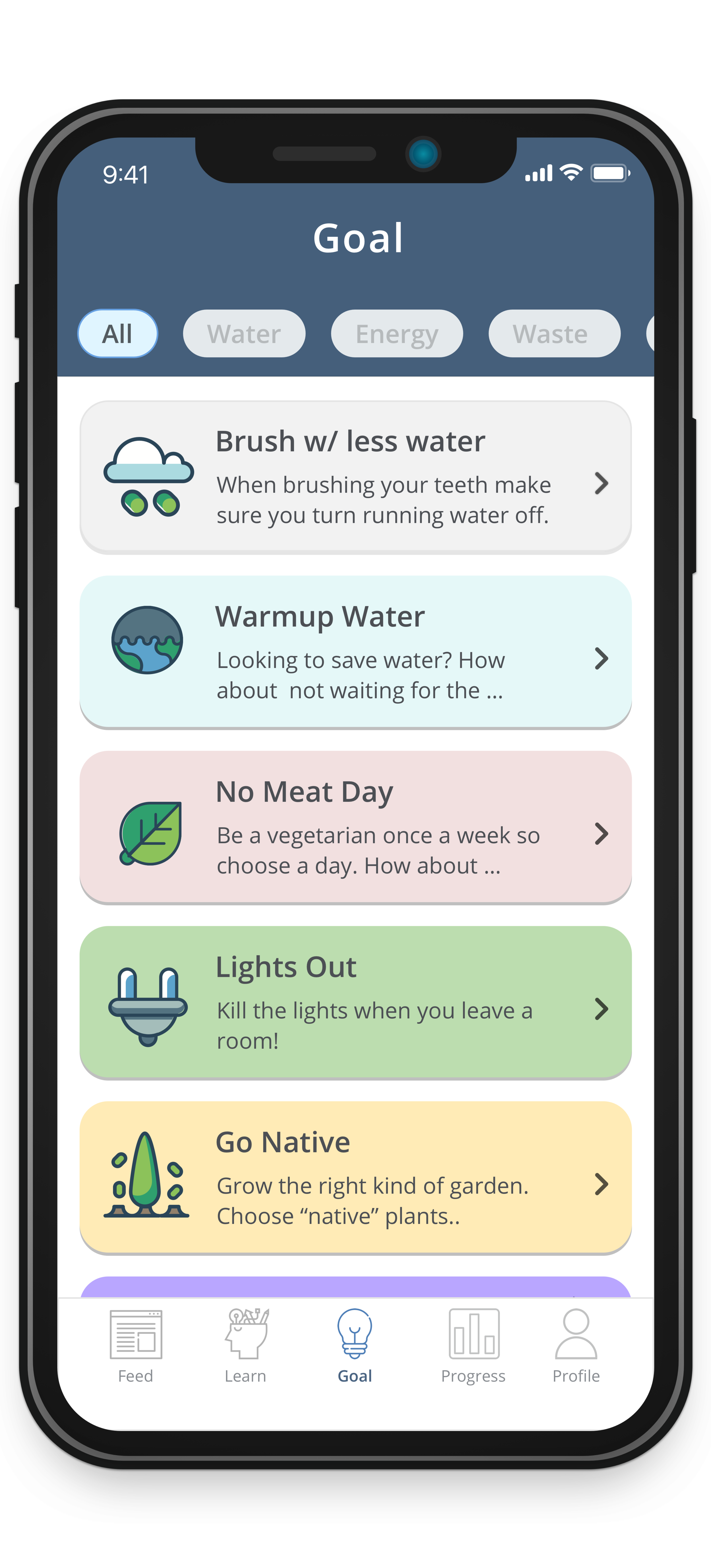
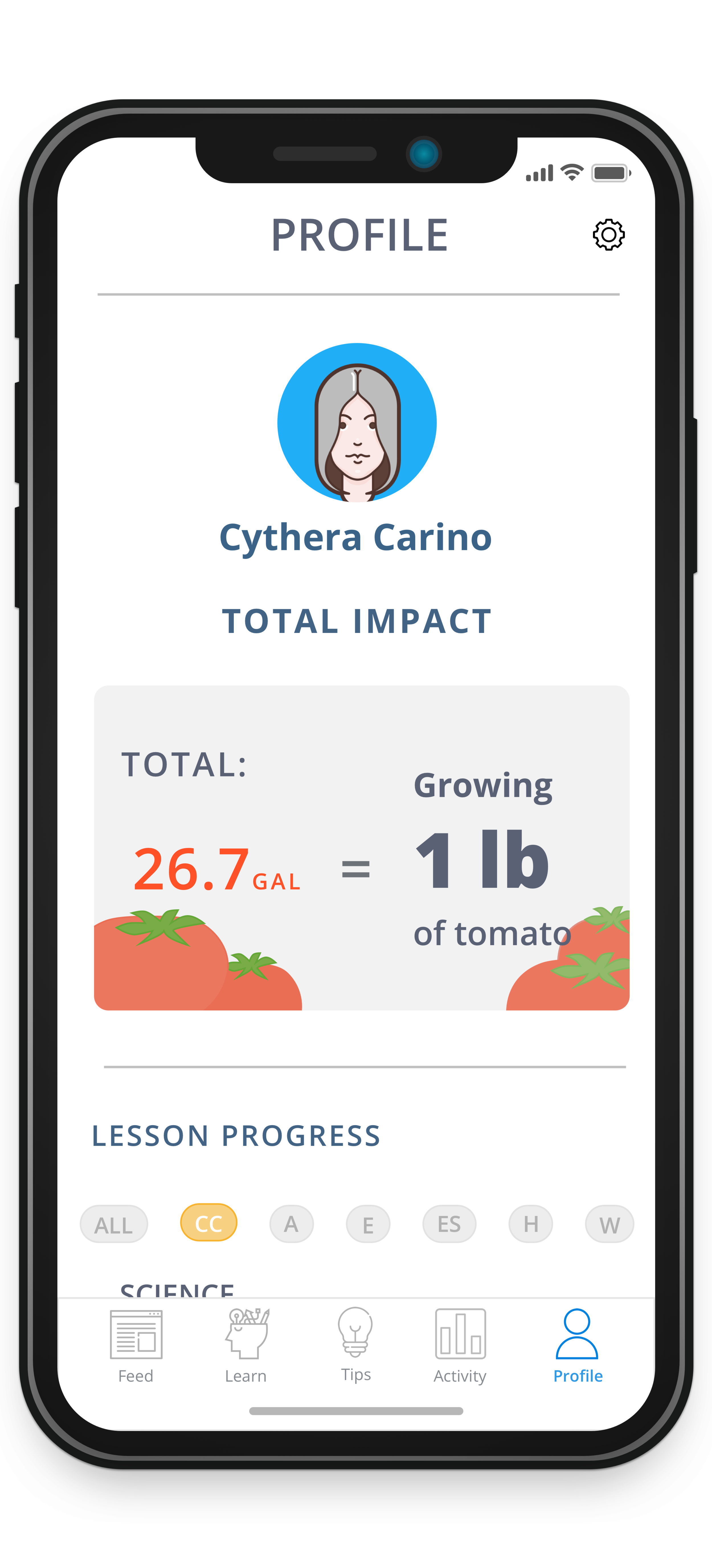
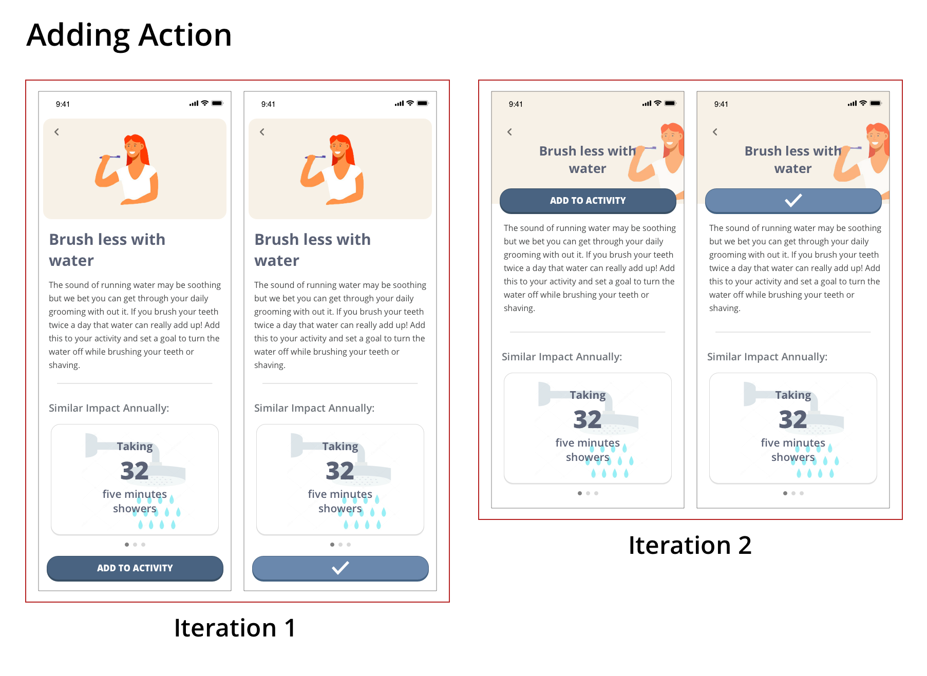
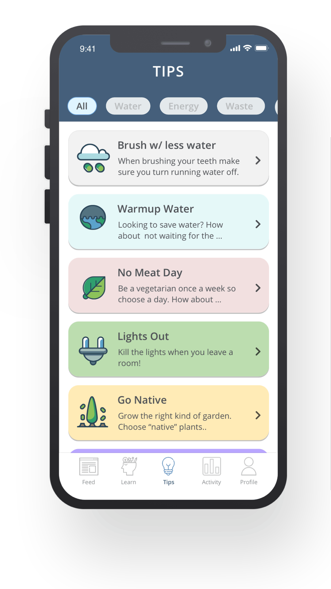
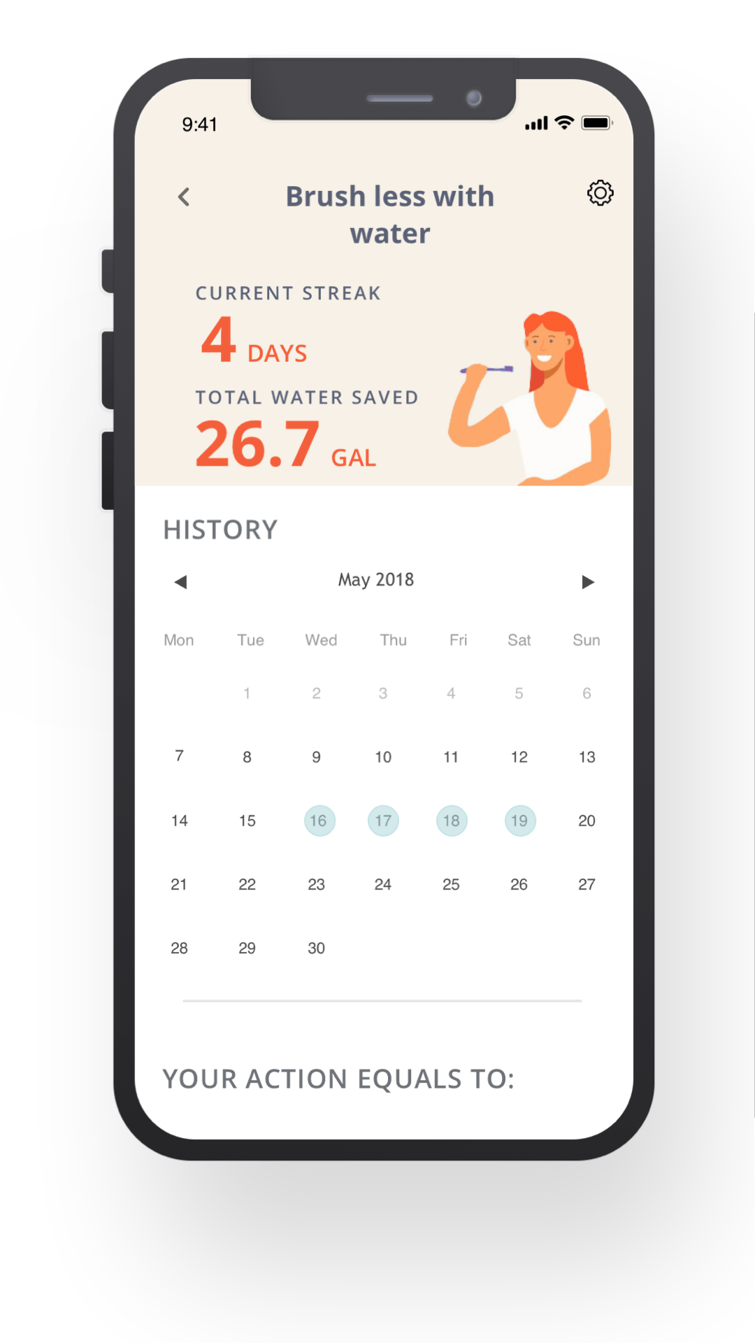
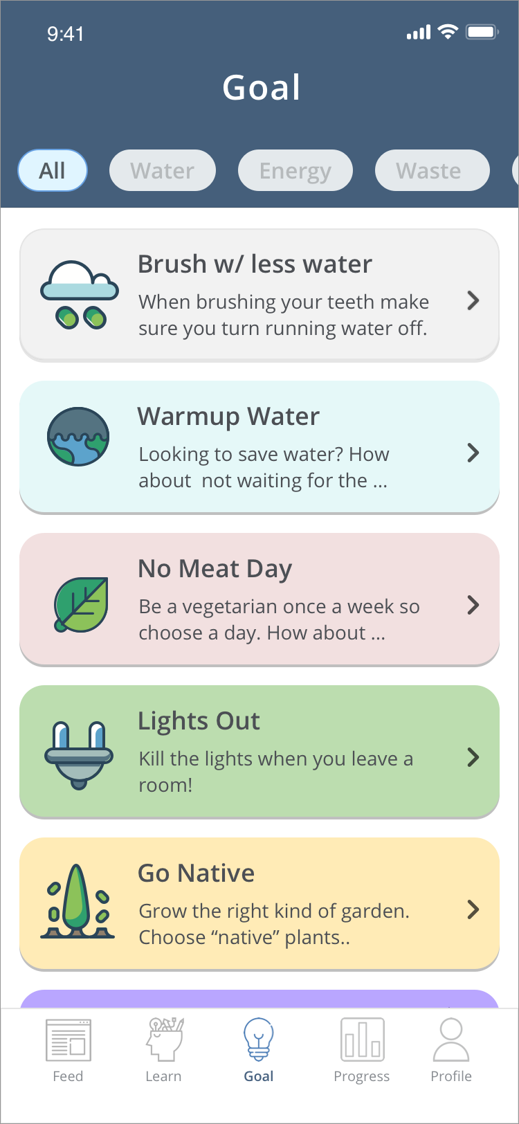
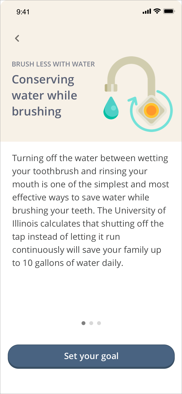
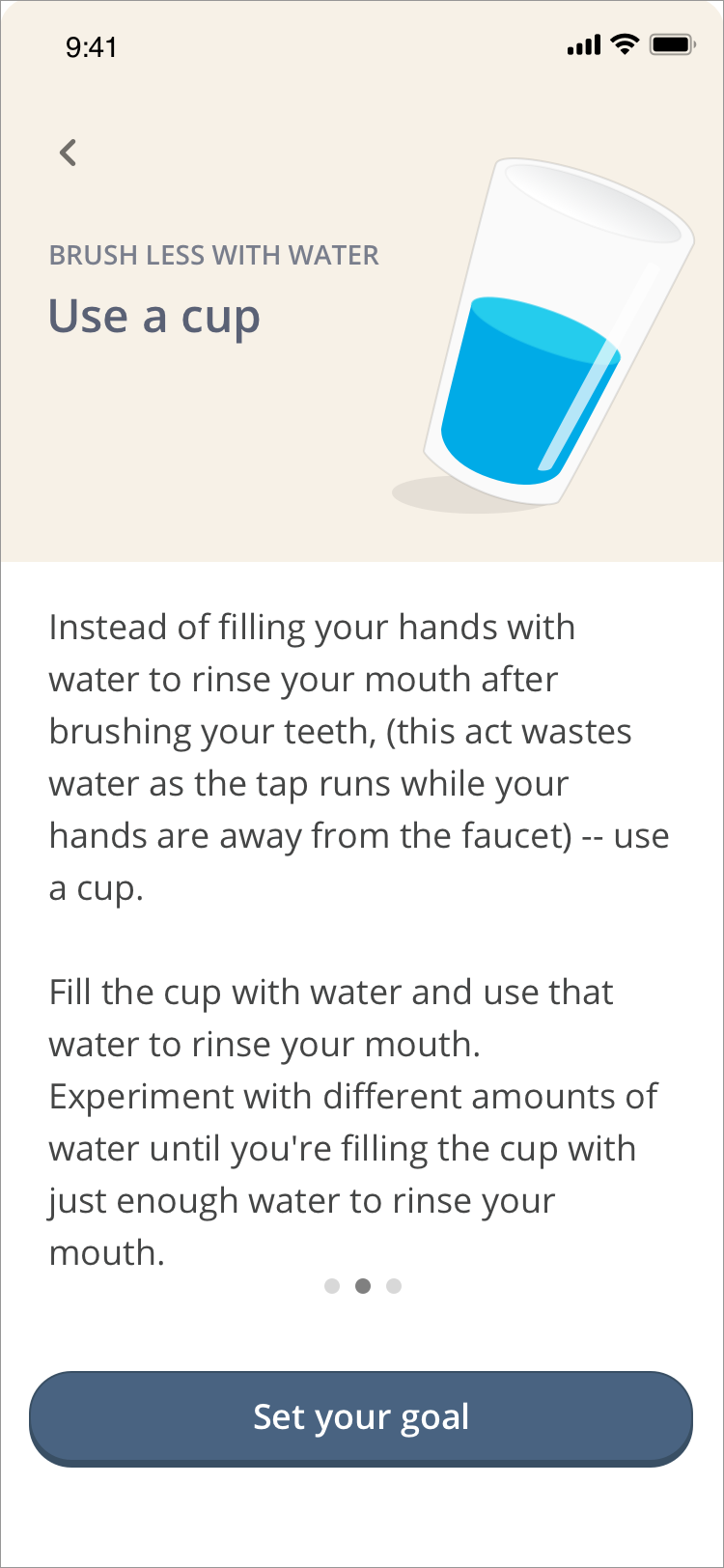
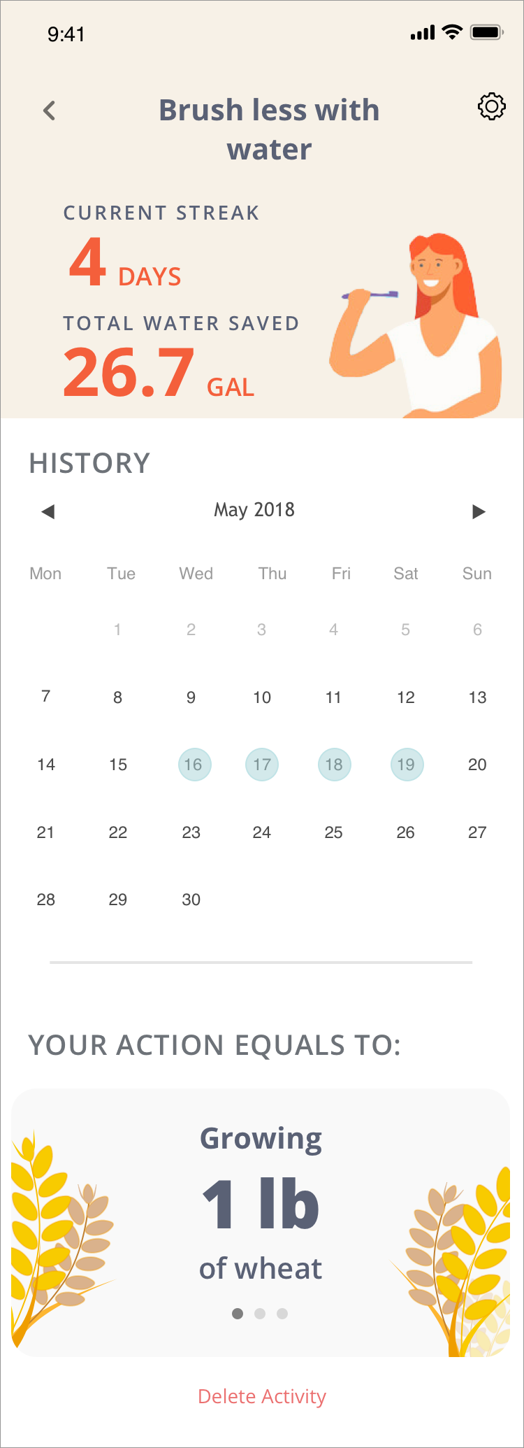
Group 4 — Action: This feature is to provide users with suggestions on how they can help the environment. To eliminate inconvenience, the recommendations provided are activities we already do, such as turning the water off while brushing our teeth. This feature also provides the user measurements of their impact that they can understand.
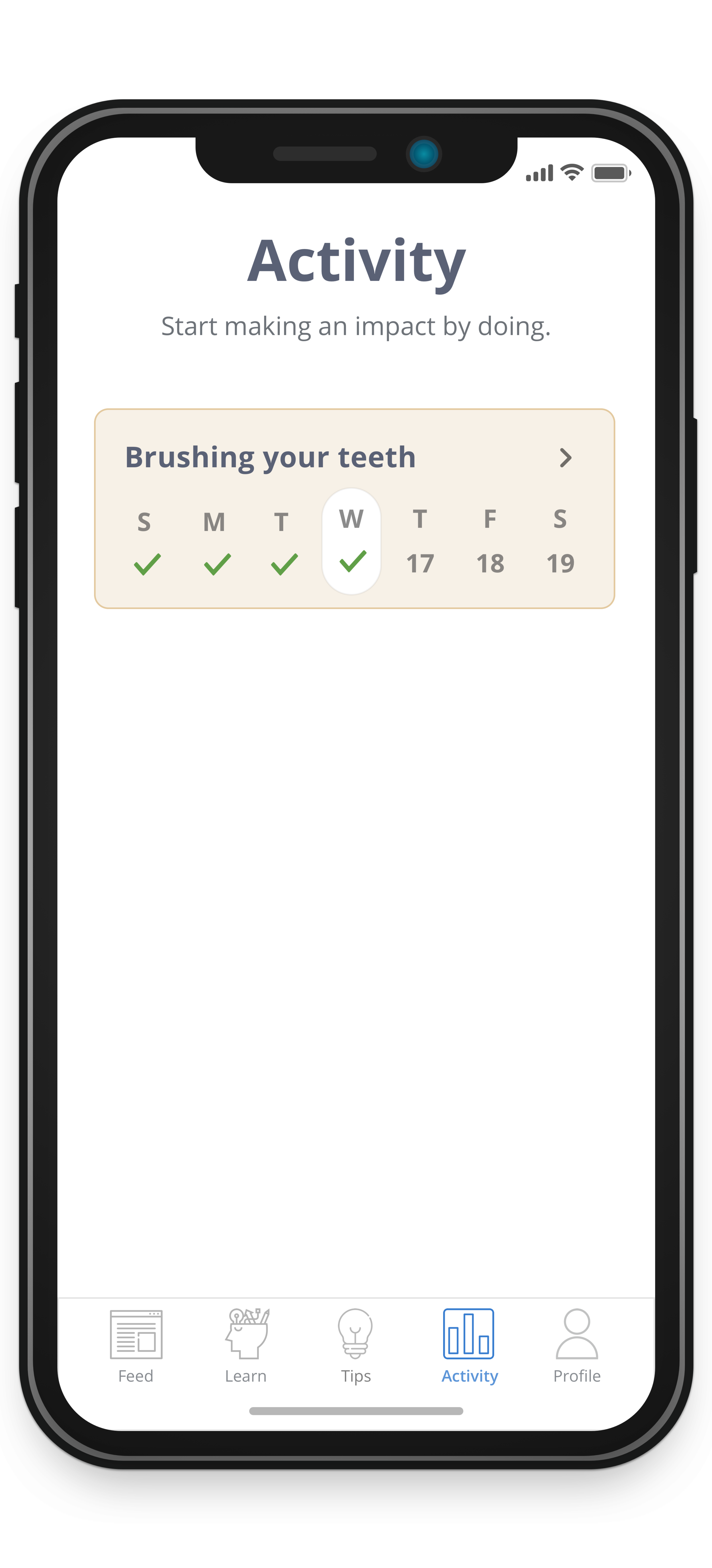
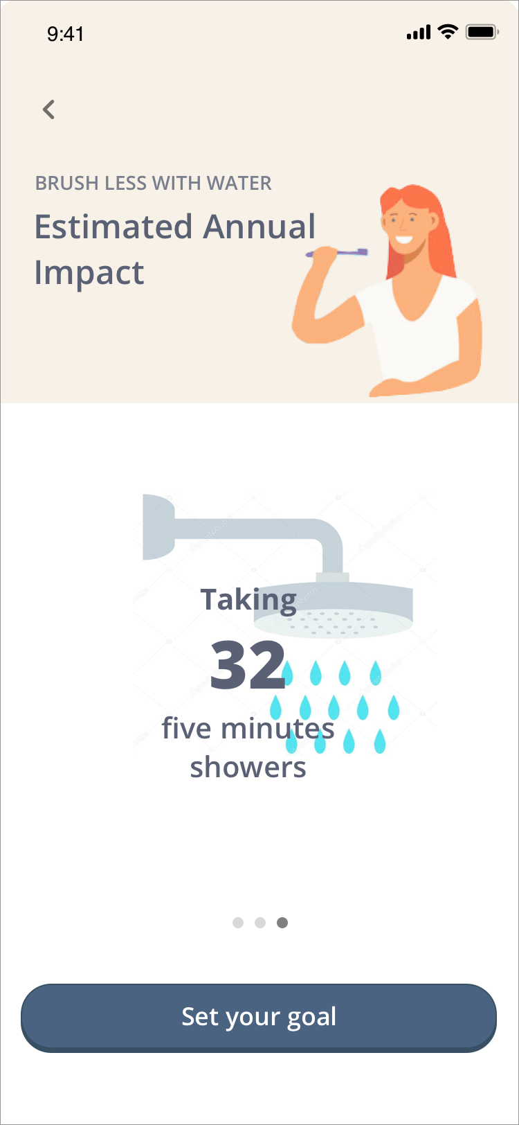
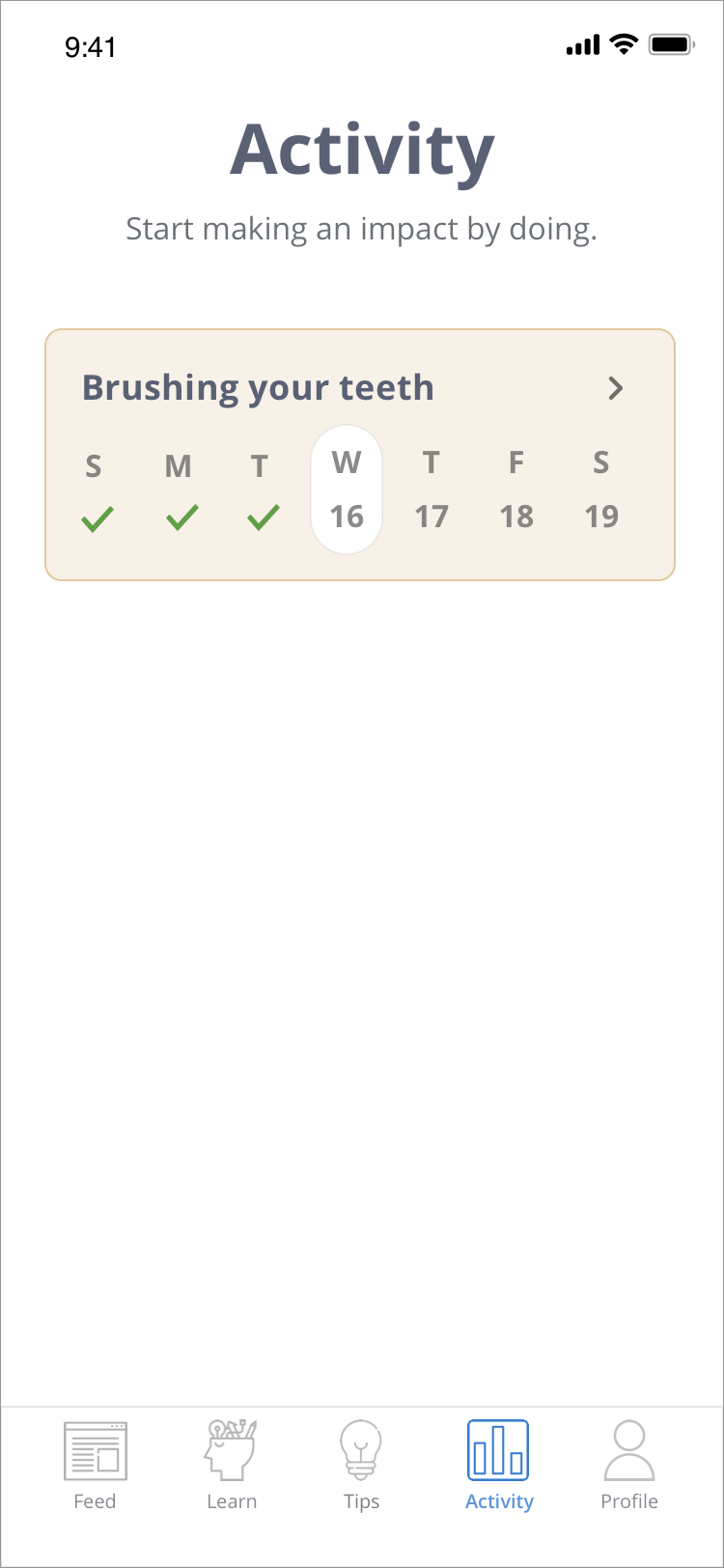
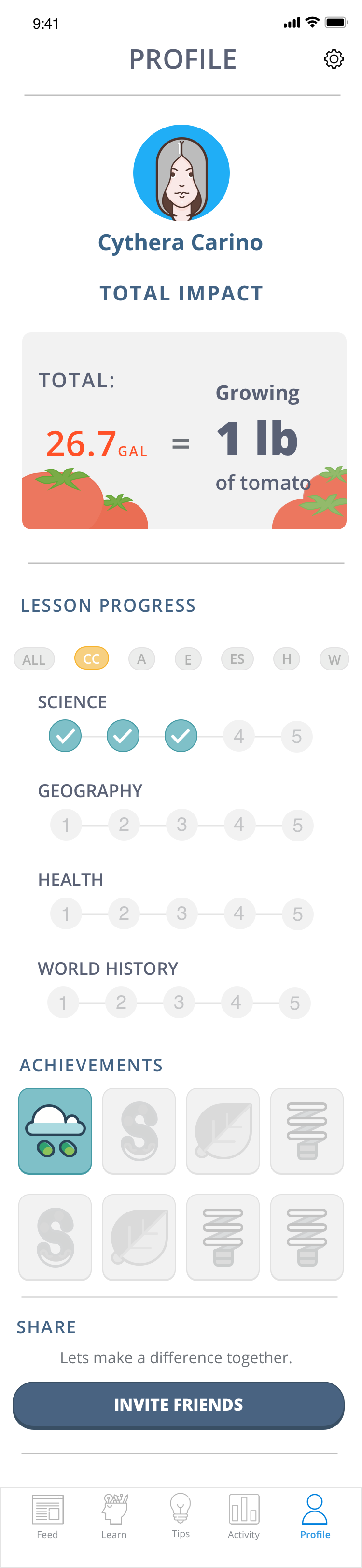
Group 5 & 6 — Tracking/Awareness: A tracking feature was designed to help the user understand their positive environmental impact. Their impact is also converted in a way that can be easily understood, such as turning their C02 inputs into a more relatable comparison.
EVALUATE
Usability Test 1
The goal of this usability testing is to understand functionality, discoverability, and ease of use of the mobile application. I wanted to validate if the users recognize the app's activity page's objective and also will the "Learn and Action" page complicate the flow of the app.
I tested four users who are part of target demographics — 3 users were women and one man. Three of the usability test was done in person, while one was remote through Skype.
Findings:
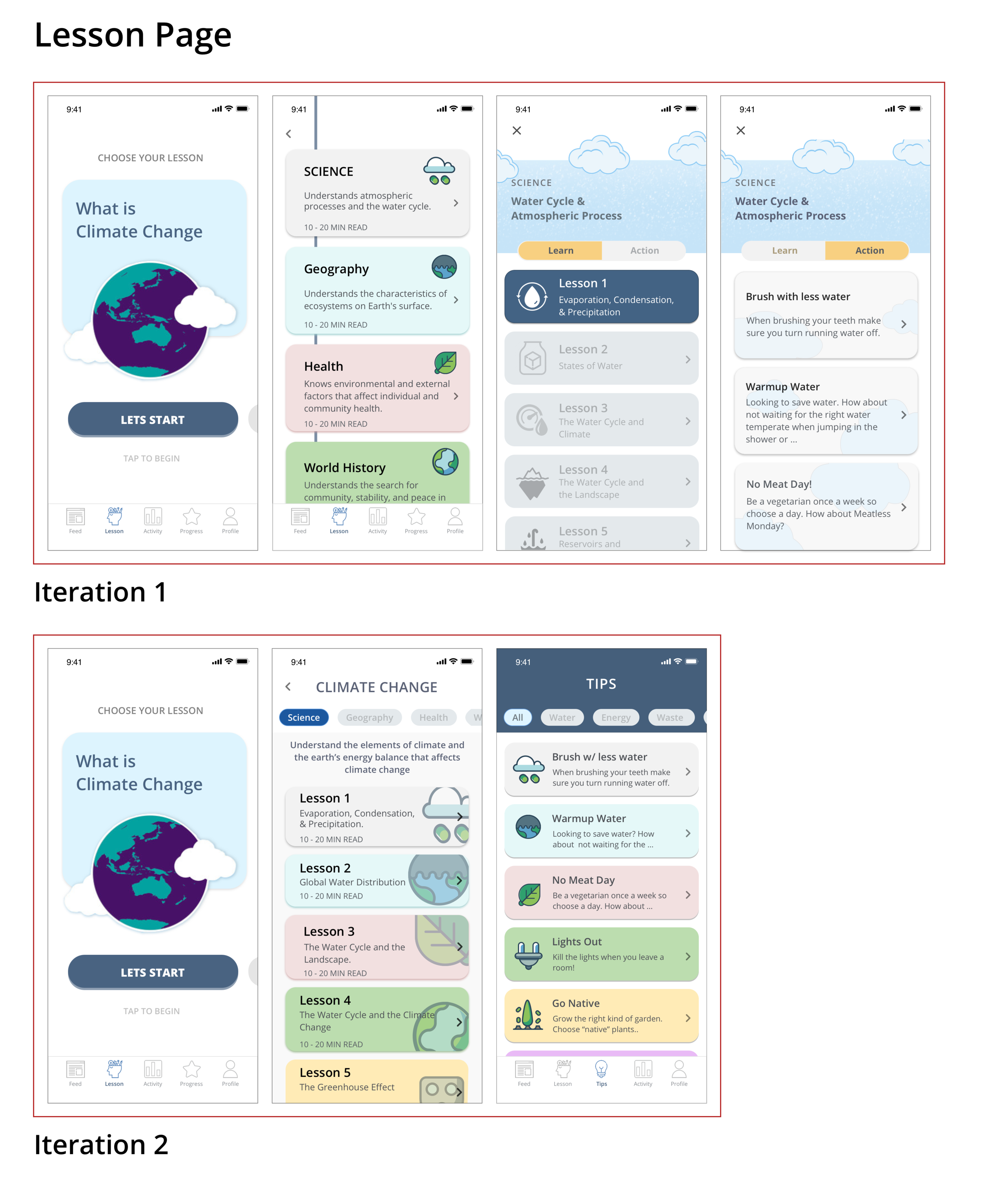
Lesson Page: Three users found the Lesson page was a lot of effort. One user even said, "This is a lot of work!" They were confused about the Lesson and Page toggle and did not understand why it was together on the same page. Two users commented on the word "Action" and how it did not resonate with them.
Activity Page: The page did not accomplish what it meant to do, which was to help users organize their Action and to find their task/goal easily. It was confusing to the users, which then complicated the entire flow and intent of the app. Feedback was "Lesson and Action" are both activities, so why was it only in Action.
Adding to a Day: Three users were not able to complete the task of inputting or adding a date on their activity. When asked to do the task of adding a day brushing your teeth, they stop for a couple of seconds and click around, which leads to the expand button.
By understanding the frequency, impact, and persistence of the problem, I was able to prioritize and organized the issues that need to be improved. Below is the table I used:

SYNTHESIZING AND REDESIGNING
USABILITY TEST 2
What went well:
After separating the Lessons and Action to its own page, the users were now able to complete tasks with ease. Also by renaming the Action to Tips was more intuitive, and users were able to figure out what the page intended to do. The 2nd navigation to organize the categories was also more straightforward, and users immediately recognized the purpose of the navigation, which was to arrange the topics.
What needs to be improved:
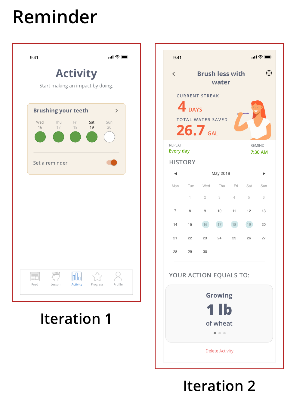
Iteration 2 on the reminder function was still tricky for the users. They did believe that having two separated inputs was difficult. By redesigning this into a simple button (iteration 2), it will create a clean and uncomplicated effort for the users. I also included feedback stating that users have completed a lesson. Users were 50/50 regarding this, so I will need to revisit this design.

FINAL DESIGN
KEY FEATURES
INSIGHTS
There were 3 key insights that drove my project. The first one, "Bite-sized learning." Learning complex materials can be intimidating, users need a simple, and engaging ways of reading articles or lessons. The second one is the idea of "micro-tasking." Research has indicated that users believe that helping the environment is either difficult or expensive, users need a tool that disprove that belief. The third one is "relatable results." Carbon footprint data can be confusing, users need a way to understand their impact in an easy and relatable way.
BITE-SIZED LEARNING
Contents are organized in bite-sized and focused information to create a better experience for our users and provide retainable materials. Bite-sized is excellent for mobile, and it offers the chance to deliver short bursts of training content to the modern learner on the move. Research has indicated this style of content delivery with mobile learning increased appeal to a millennial learner by 71%!
Micro-tasking
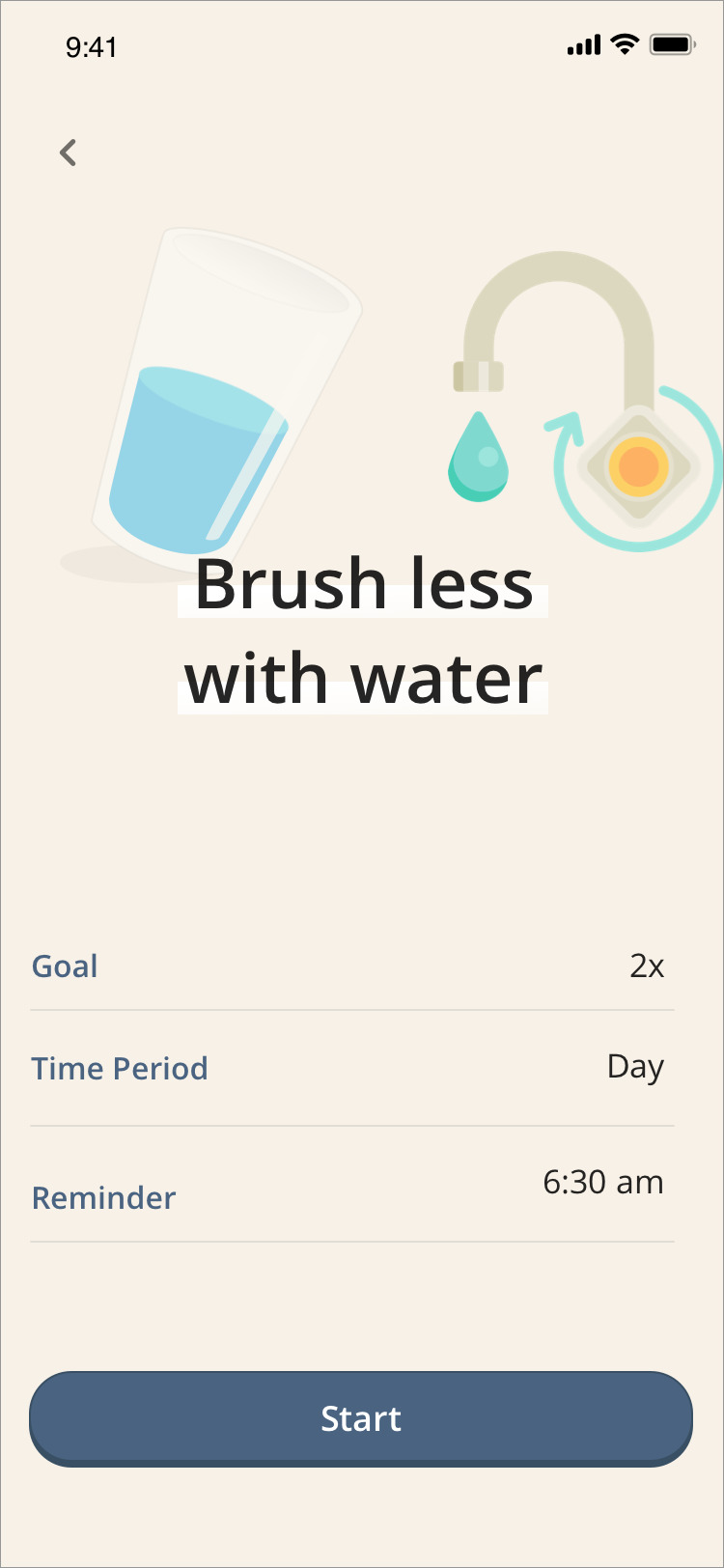
Micro-task cover of two concepts — first, one is providing users with recommendations that are simple, easy, and complementary to their daily routines e.g. brushing teeth, washing hands. Second concept is “taking baby steps.” The Goal and Reminder feature will support the user's greener lifestyle by breaking down the tasks in a painless way. Users can customize their goals and also can set up reminders to help them be more environmentally conscious.
Relatable Results
To clearly show the users carbon footprint impact, Lupa is transforming their carbon footprint data into more relatable and recognizable data. Users need to know their actions are making a difference, and by converting carbon footprint calculations into simple and understandable terms, we can create a more valuable and rewarding experience for our users.
ALL SCREEN

NEXT STEPS
Create a new topic to add to the Climate Change subject such as Waste or Overpopulation.
Adding notifications to help our users remind them of any tasks they need to do and also create this habit.
By designing an MVP to help us with Climate Change was incredibly fulfilling to me. It also changed my daily behaviors. With this increase of awareness, I became more observant of the environmental problems we were facing and became more curious about how we can solve the issues.