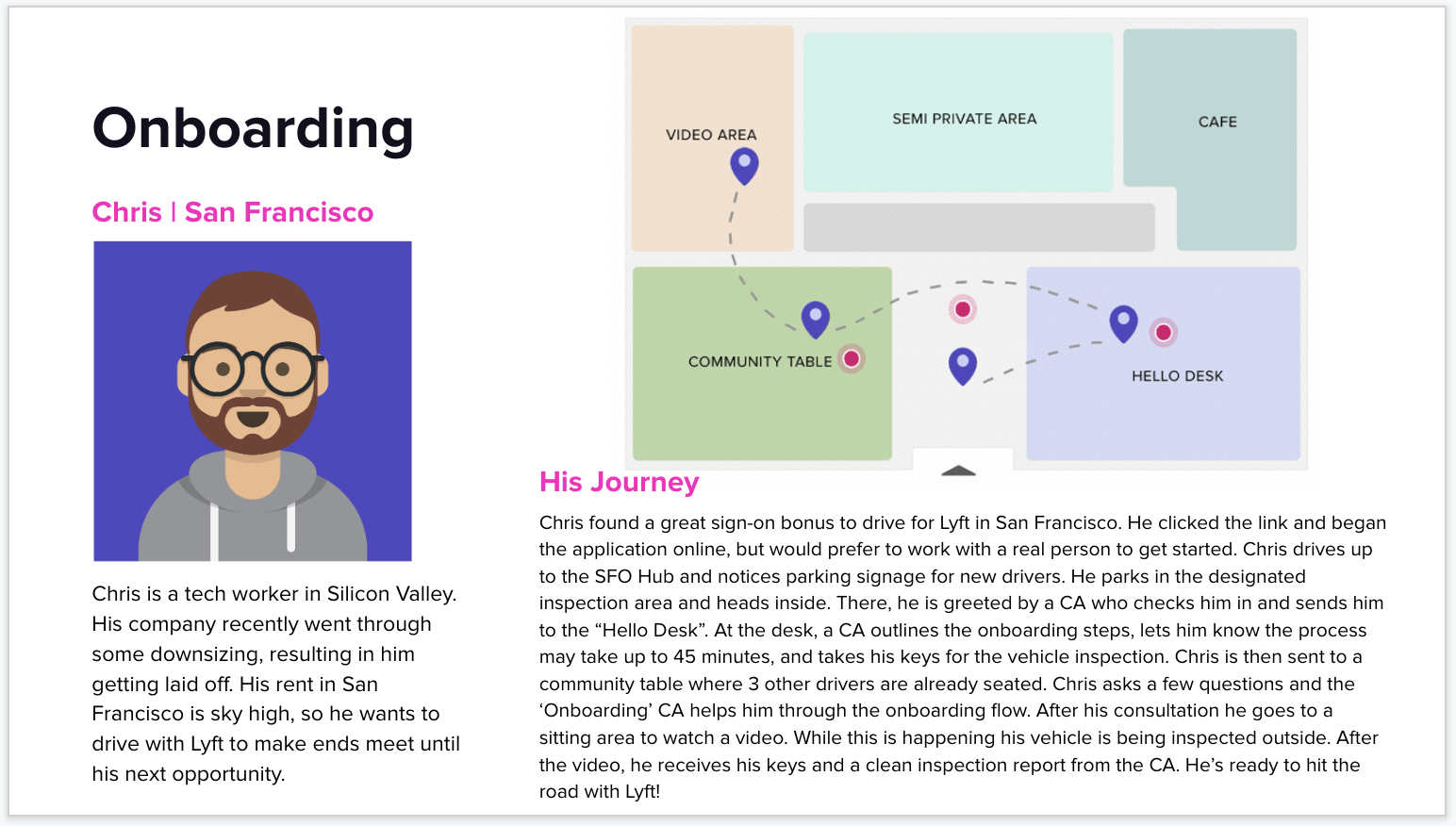
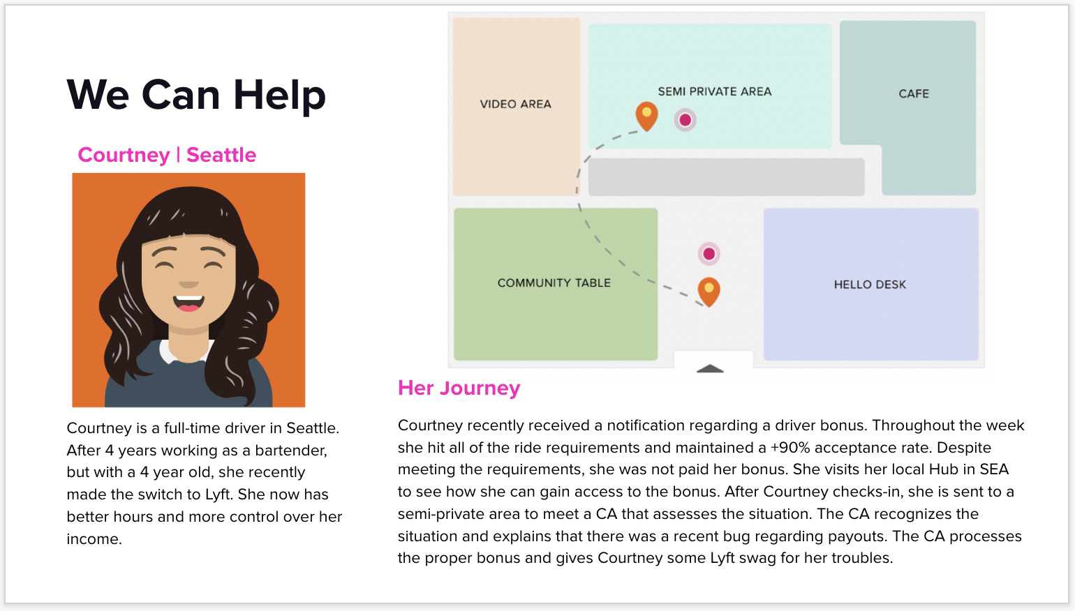
LYFT
Lyft is opening up a new retail store for drivers. The goal of this new space is to help drivers with any questions or problems they might have. Each different parts of the space is created to solve particular problems ranging from onboarding new drivers to payment dispute.
PROBLEM
With a text heavy slide, the team needed compelling visual that is easily digestible and can clearly communicate each driver’s journey and how they navigate the new space to the executives.
TIMELINE
1 full day for the entire slides, 1 month to help with edits needed by the team.
SOFTWARE
Sketch, Principle
KICK OFF
First Meeting:
The Retail Operations Team wanted to strengthen their presentation for the Executive team by using engaging visuals. I requested for any designs that they like as a baseline and for any assets that will be beneficial in fully understanding the drive's journey.
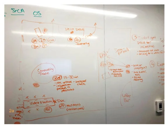
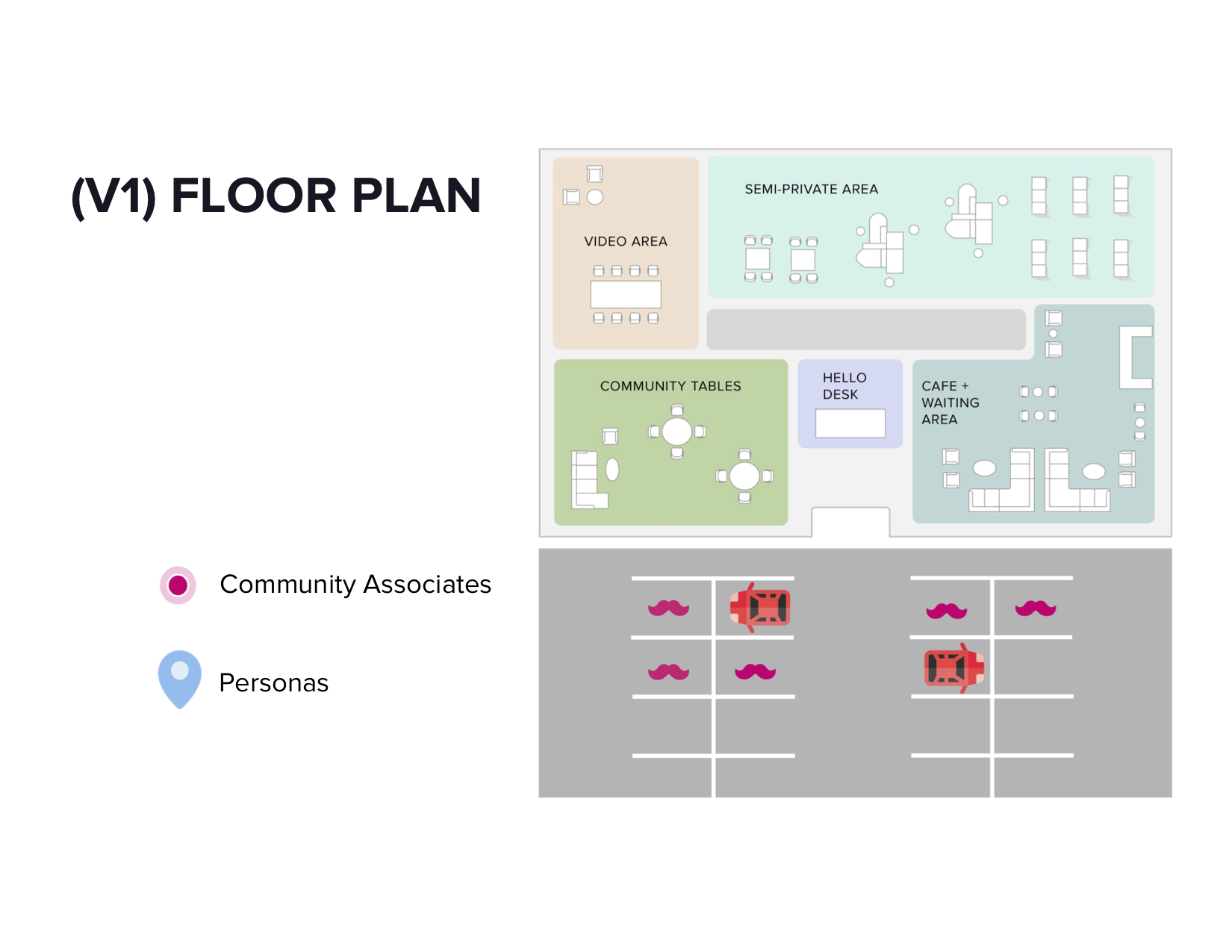
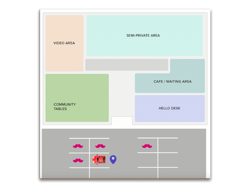
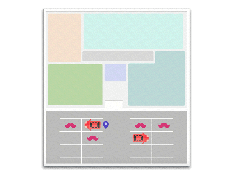
Hub Layout: This was the first sketch of the layout of the hub and circular shapes represent the drivers. Image also showed how each Driver was going to use the new Lyft space.

Design guideline: This was the space layout that the interior designer created for the retail team. To be more time efficient I decided to base my design on the original layout because people are already familiar with this layout and focus on creatively create the driver’s journey.
REDESIGN
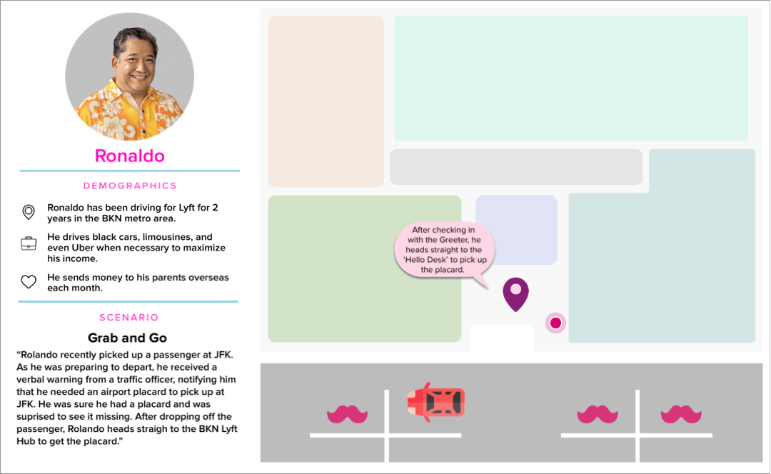
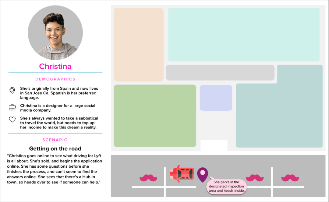
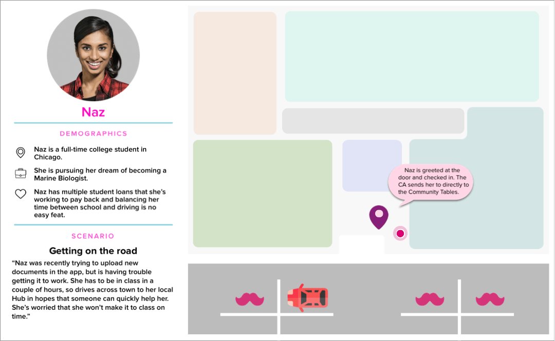
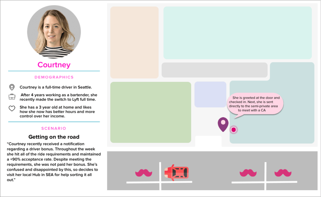
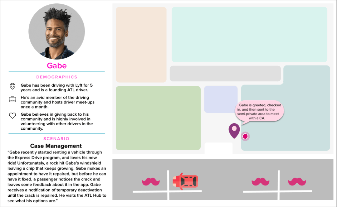
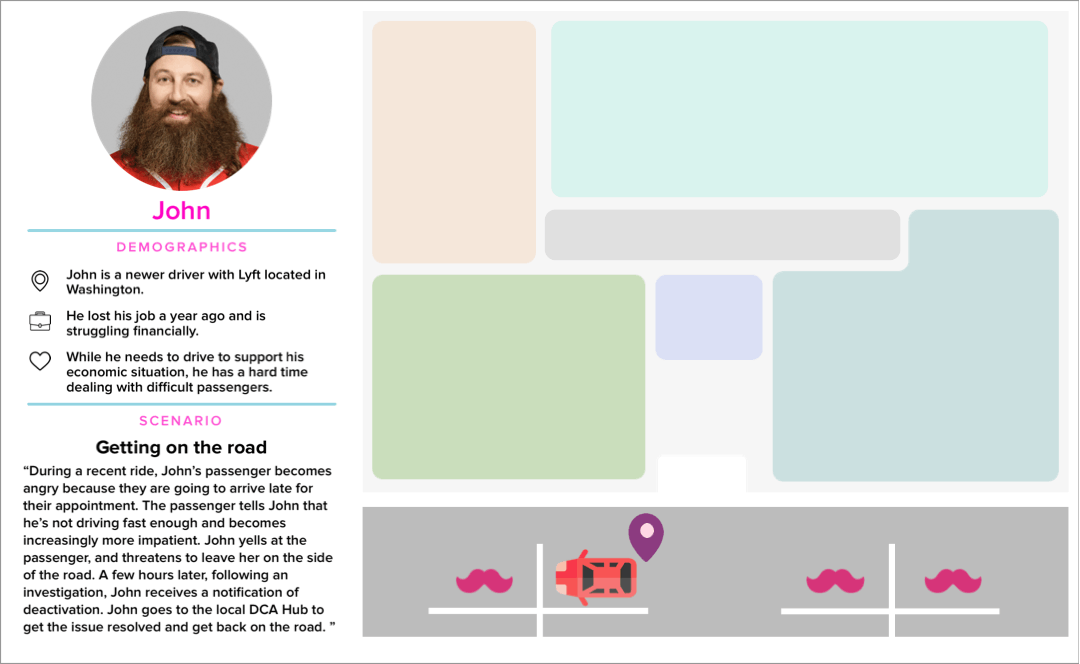
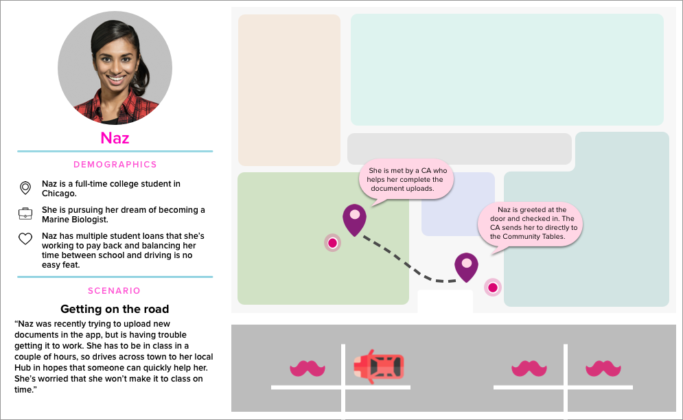
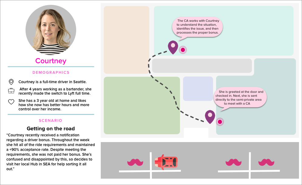
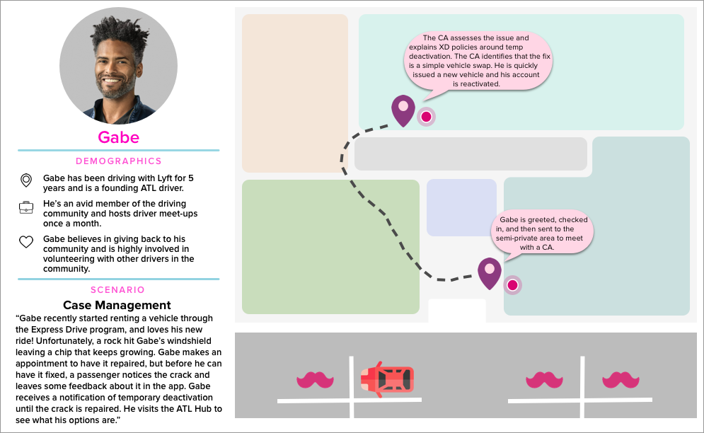
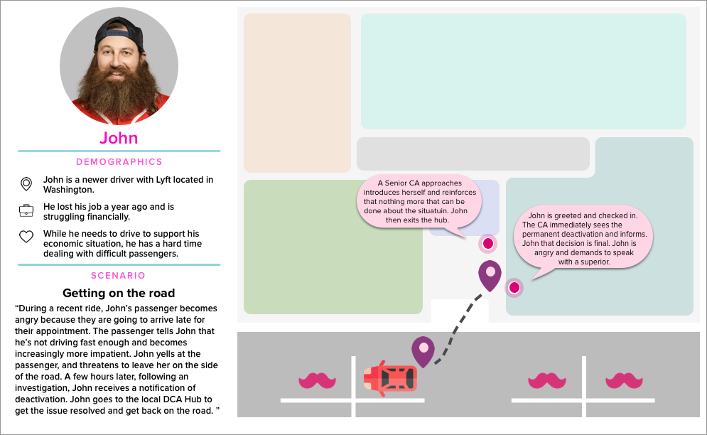
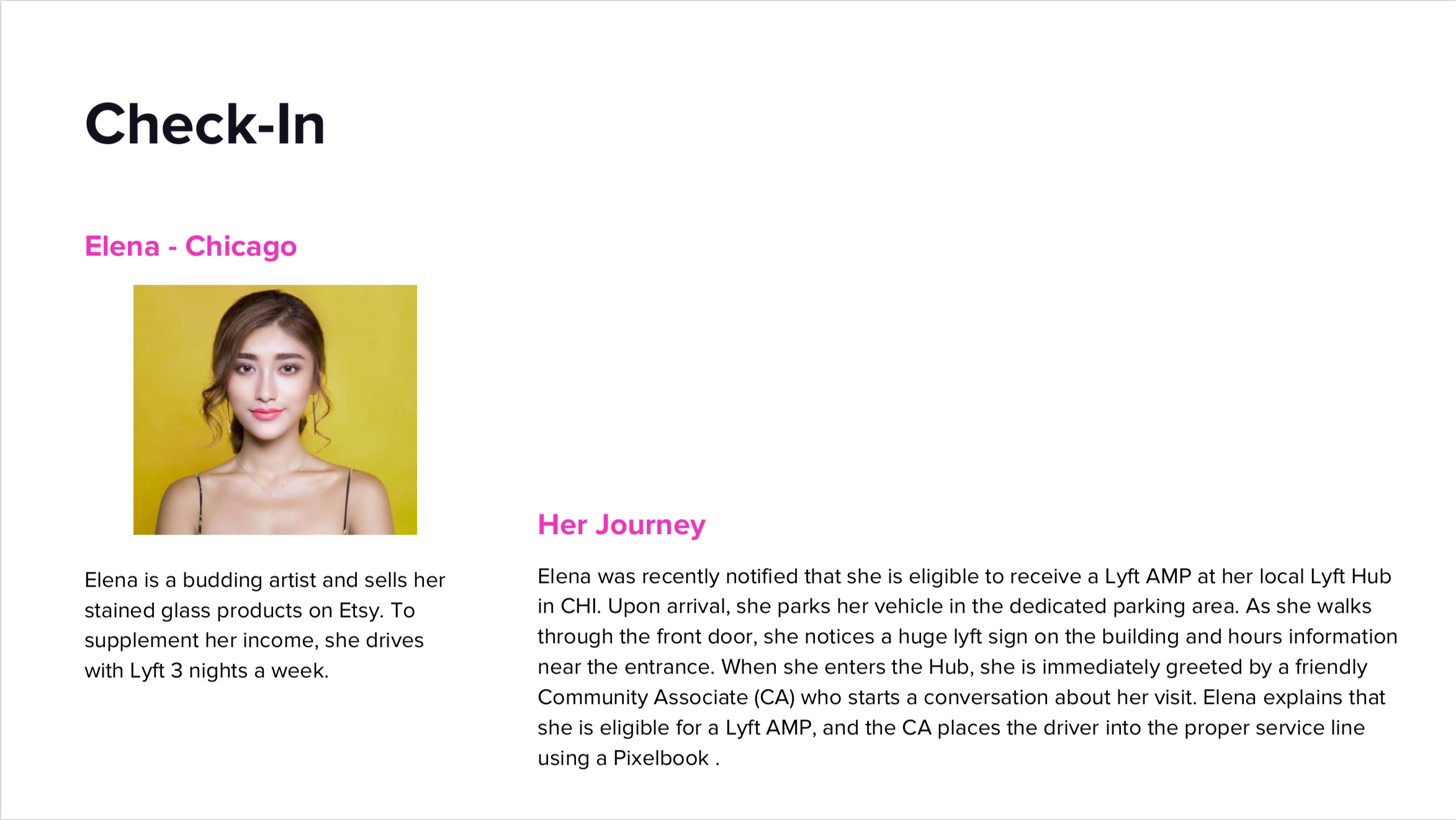
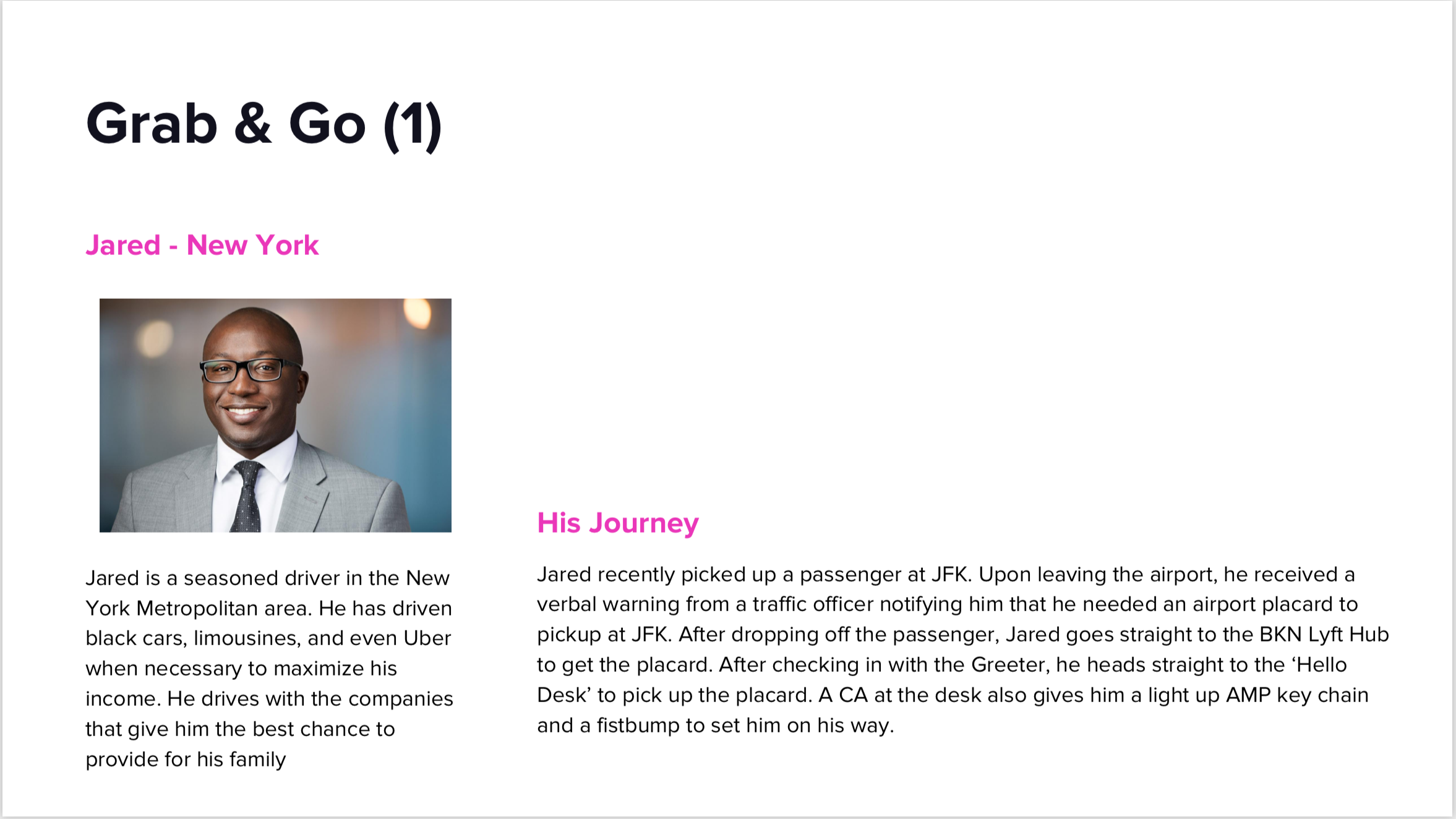
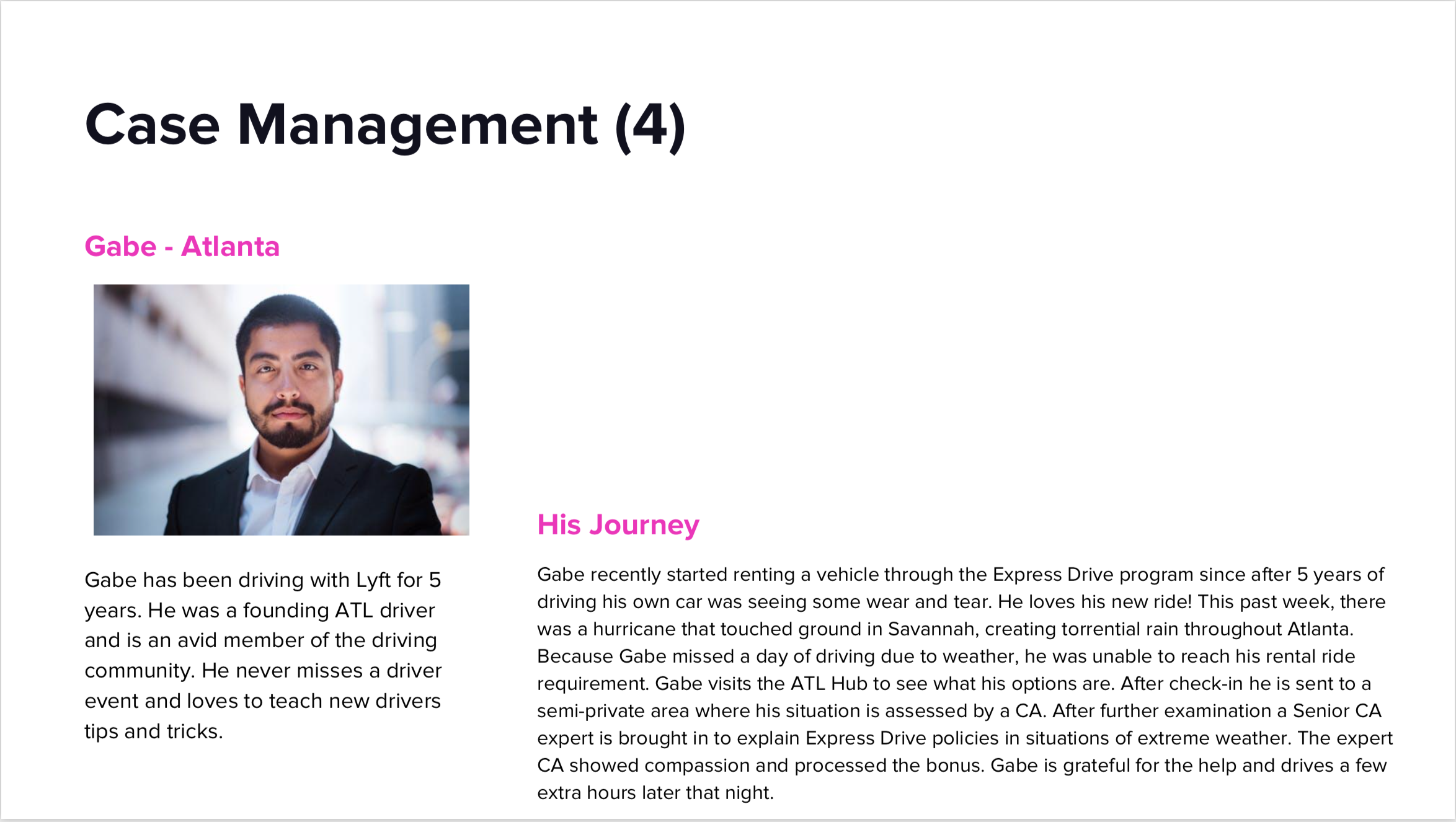
USER PROFILE + SCENARIO
Below was the original slide deck that the team created for their presentation including the user profile and user scenarios. With no additional information regarding the persona, I had to creatively build upon what was given to me. For the first draft, I want to focus and strategically find a solution on how to effectively tell the stories of the drivers.

FIRST DRAFT
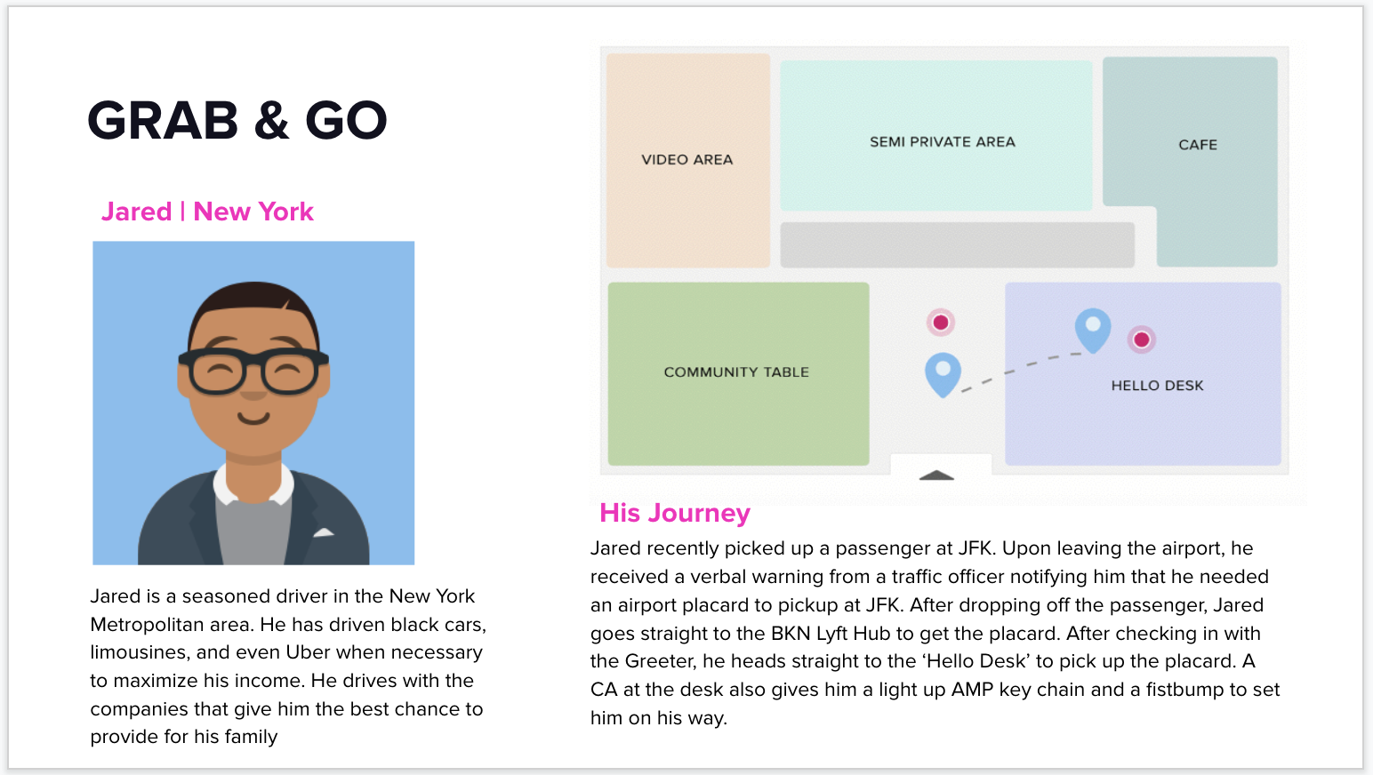
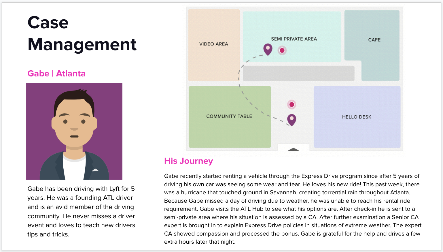
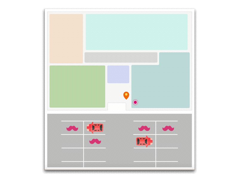
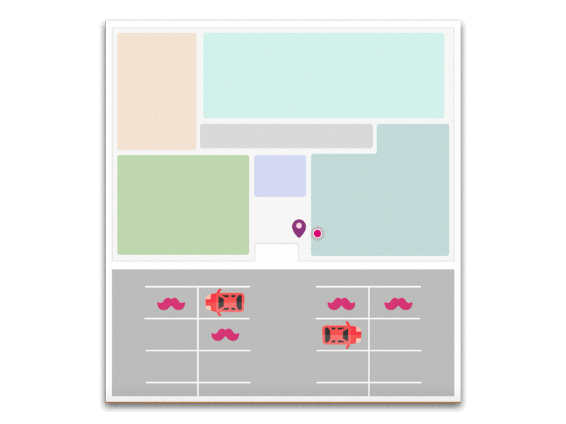
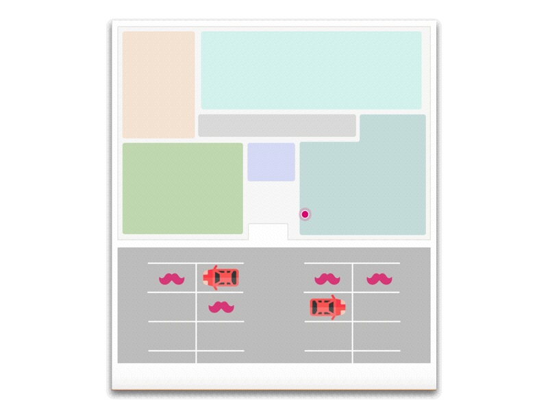
By using illustrations to present the driver profile images, I was able to create a more unified look because the initial photos were not complimentary of each other causing the slides to look disorganized. I also decided to start the story with a visual of the retail space to help the viewers understand and visualize the driver's journey. I used Lyft’s design elements that viewers are familiar with such map pins.

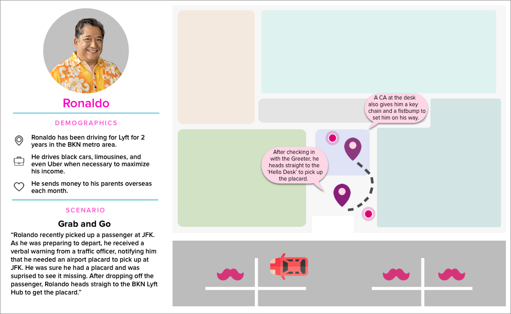
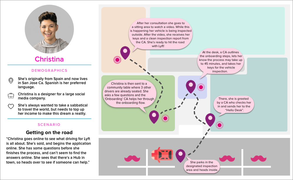
ENTER THE GIF
After creating the first draft, I wanted to take it a step further. Enter the GIF. Using GIF will display how the drivers are going to use each part of the space. The GIFs and the visuals together will support the presenters show the viewers the driver's journey with ease. Also, most importantly, the slides can now stand on its own and be its storyteller.
OUTCOME
Due to the addition of the GIF, it granted us more ways to creatively expand the stories they wanted to convey and enhance our storytelling. We used message icons to further show the interaction between the Lyft representative and the driver.
Also by studying the Lyft brand guidelines, and familiarizing myself with the color palettes, typography, and imagery, I was able to design a slide deck that is consistent with Lyft's brand identity.
After this successful project, the retail team wanted to continue our partnership. As the project develops, the team expected changes and asked me to stay to help with the visual design for future presentations.