UX/UI
CONCEPT PROJECT
SUR LA TABLE
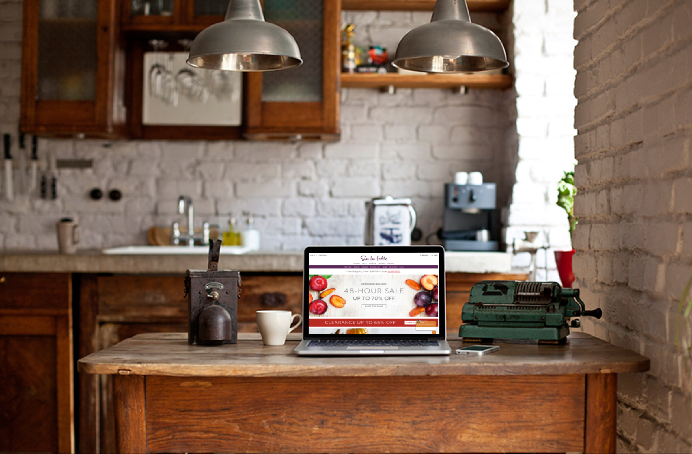
Overview: Sur La Table, Inc. is a privately held retail company based in Seattle Washington that sells kitchenware products. Customers love the experience that Sur La Table's store offers - the simple, charming, and organized layout of the store to the most helpful sales associate explaining all the needed information about the product.
The Problem: Unfortunately, the website doesn't provide the same pleasant experience. The site is cluttered and disorganized; customer service representatives are also not available online to answer any questions.
Timeline: 2 weeks
Software: Invision Sketch
GOALS + OBJECTIVES
My goal for this project is to recreate the simple, effortless, and pleasant experience that the physical store offers online.
RESEARCH
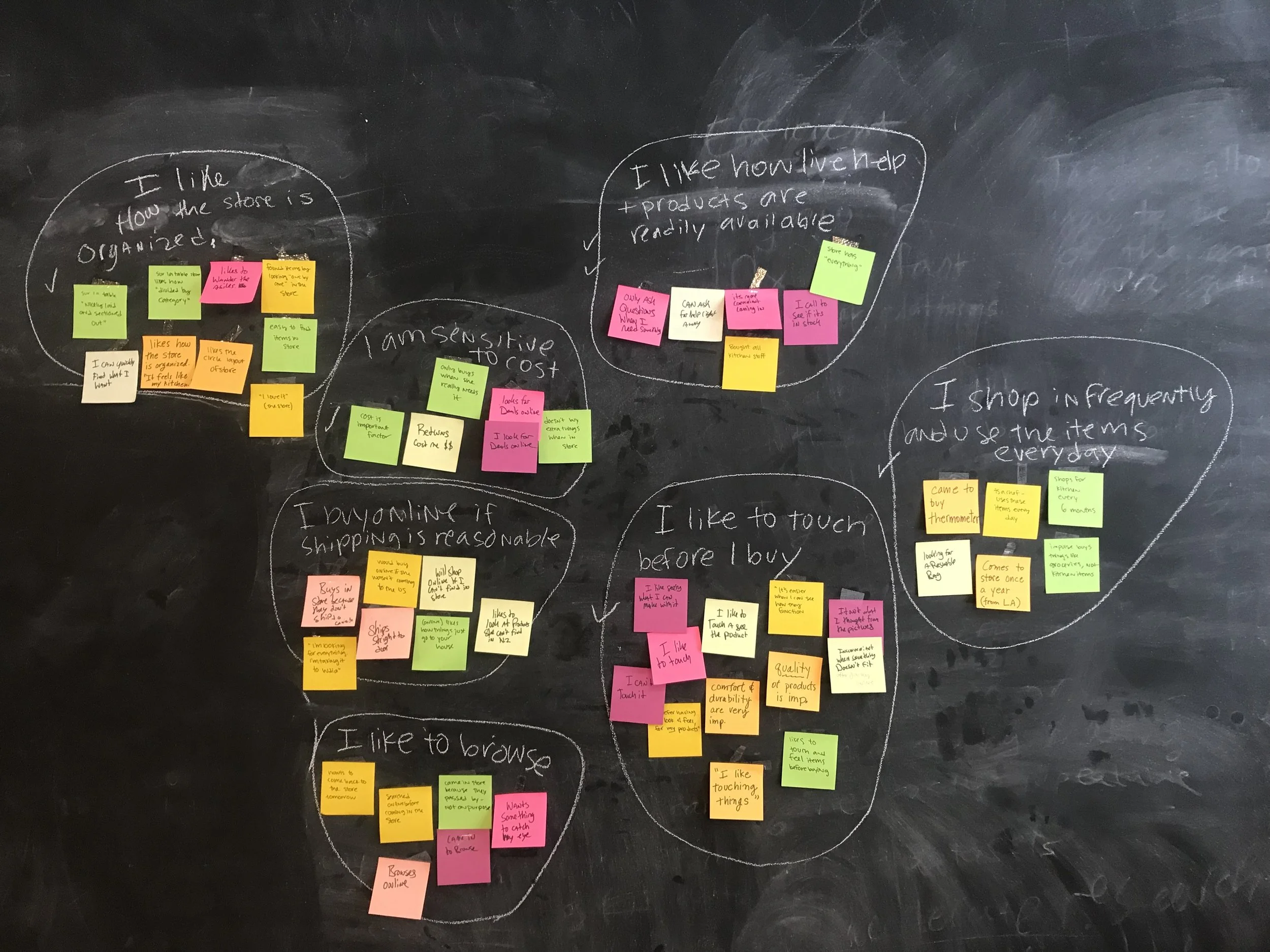
Interviews
I had 3 other UX Designer in my team to conduct user interviews and to help with defining the problem. We conducted 8 guerrilla testing and organized our notes into affinity mapping to discover what people enjoy and causing problems when shopping instore and online.
Key Insights
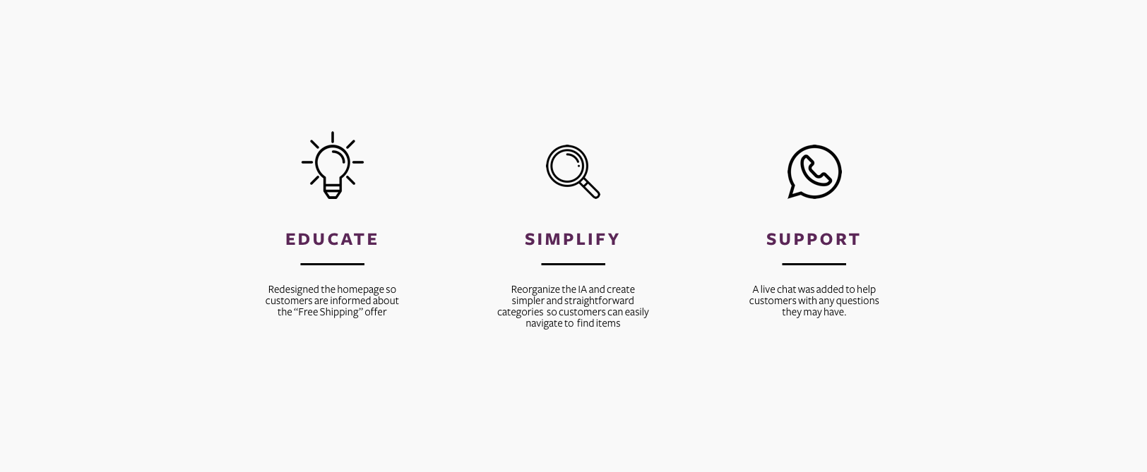
With the simple and organized layout of the store and having employees who are always available to help, finding products is never a problem. Shopping online doesn't have the readily available help that the store offers.
The Information Architecture online needs rearranging due to customer's feeling confused or overwhelmed.
The website is overwhelming and cluttered due to abundance of promotional ads and users expressed their confusion and anxiety when shopping online. We also discovered that users are apprehensive when buying items online due to their inherent desire to review the item before purchasing.
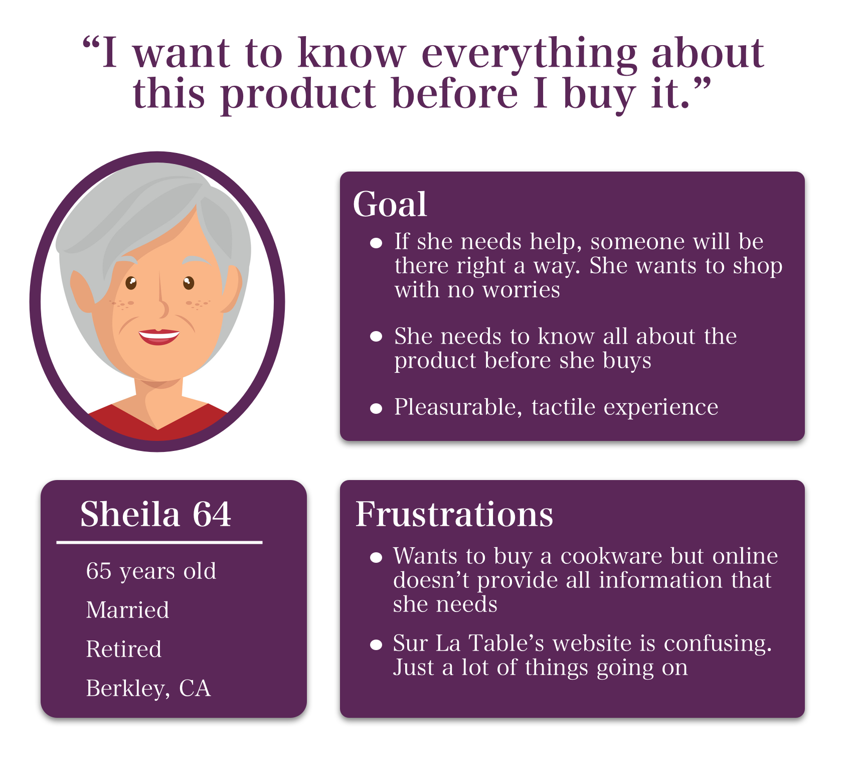
Persona
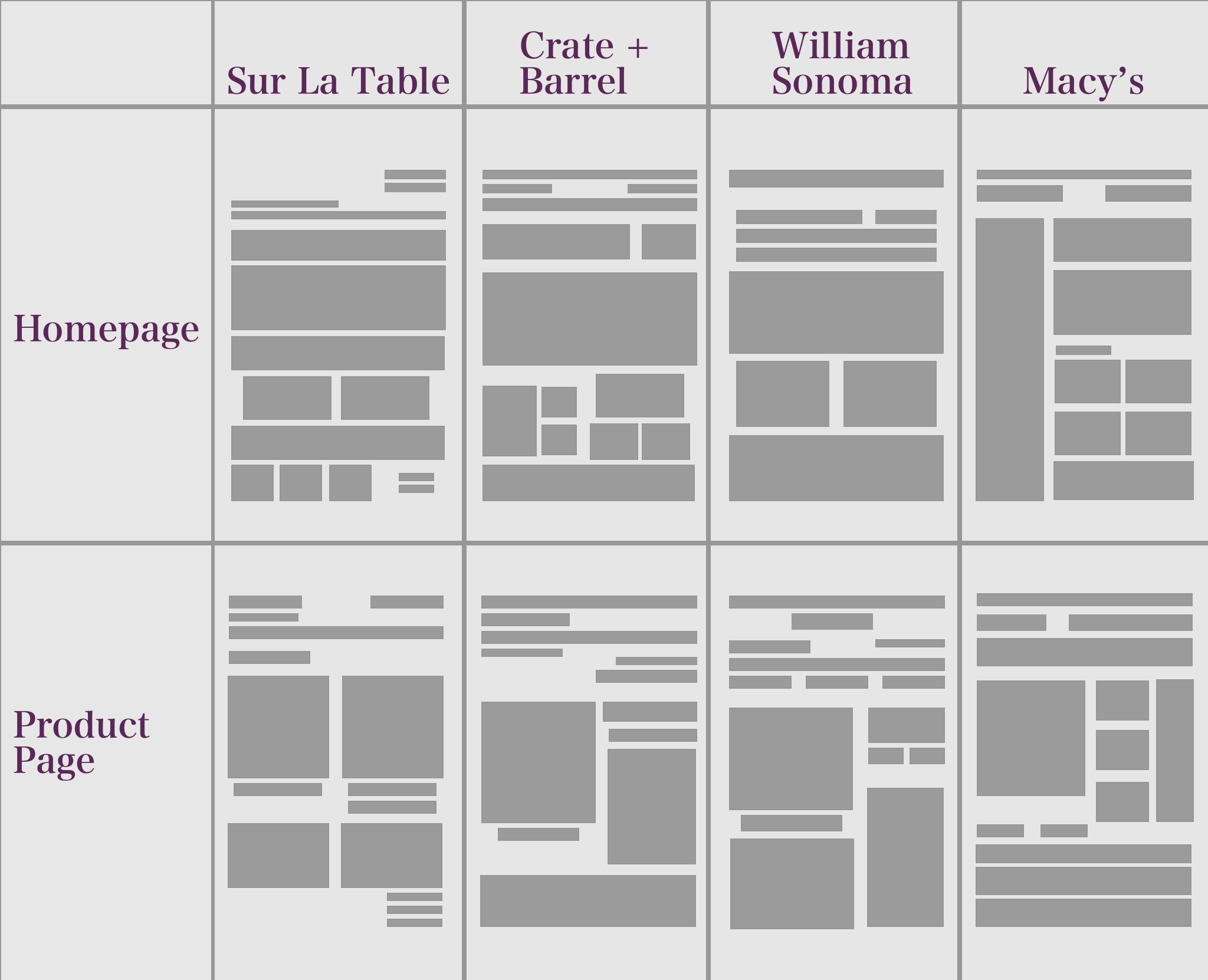
Competitive Analysis
I wanted to have a better understanding of how each of Sur La Table’s competitors is using their homepage when it comes to promotional ads, content, and visuals. By illustrating the difference using these tiles, I wanted to understand why our users think that e-commerce websites are either overwhelming and confusing.
What I learned
Too much visual noise and lack of visual order causing users to struggle to determine which parts are essential.
There's too much content ( texts and ads) on the screen and are not organized more intuitively.
IDEATION
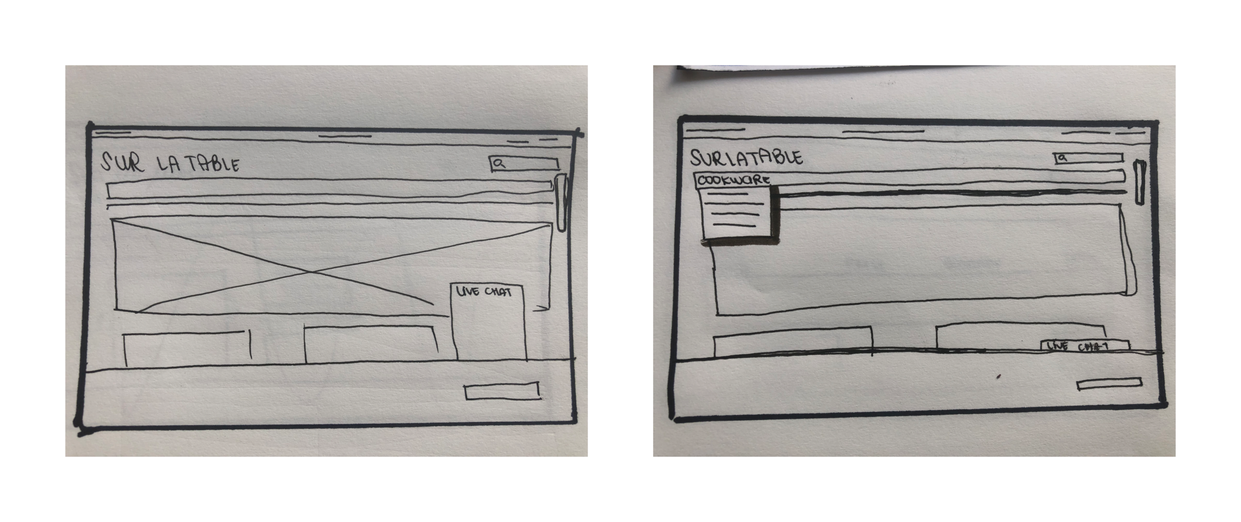
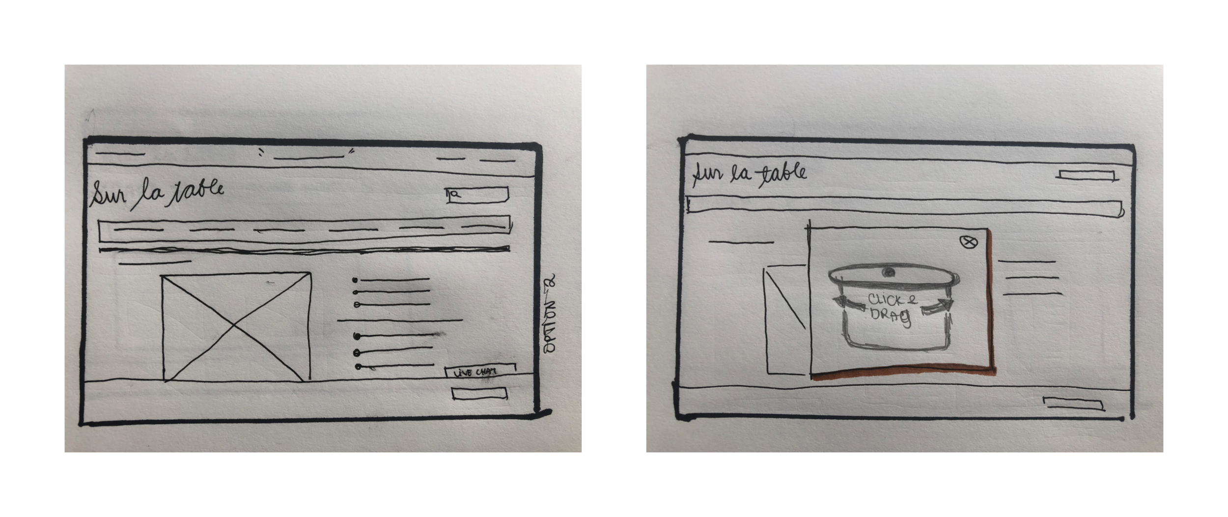
Sketches


Usability Test
Wireframes
I conducted 5 usability testing using InVision and created 2 iterations of our design. Each user feedback provided me with insight on the searching and shopping process, the effectiveness of the new filter, and also the usability of the new chat features.
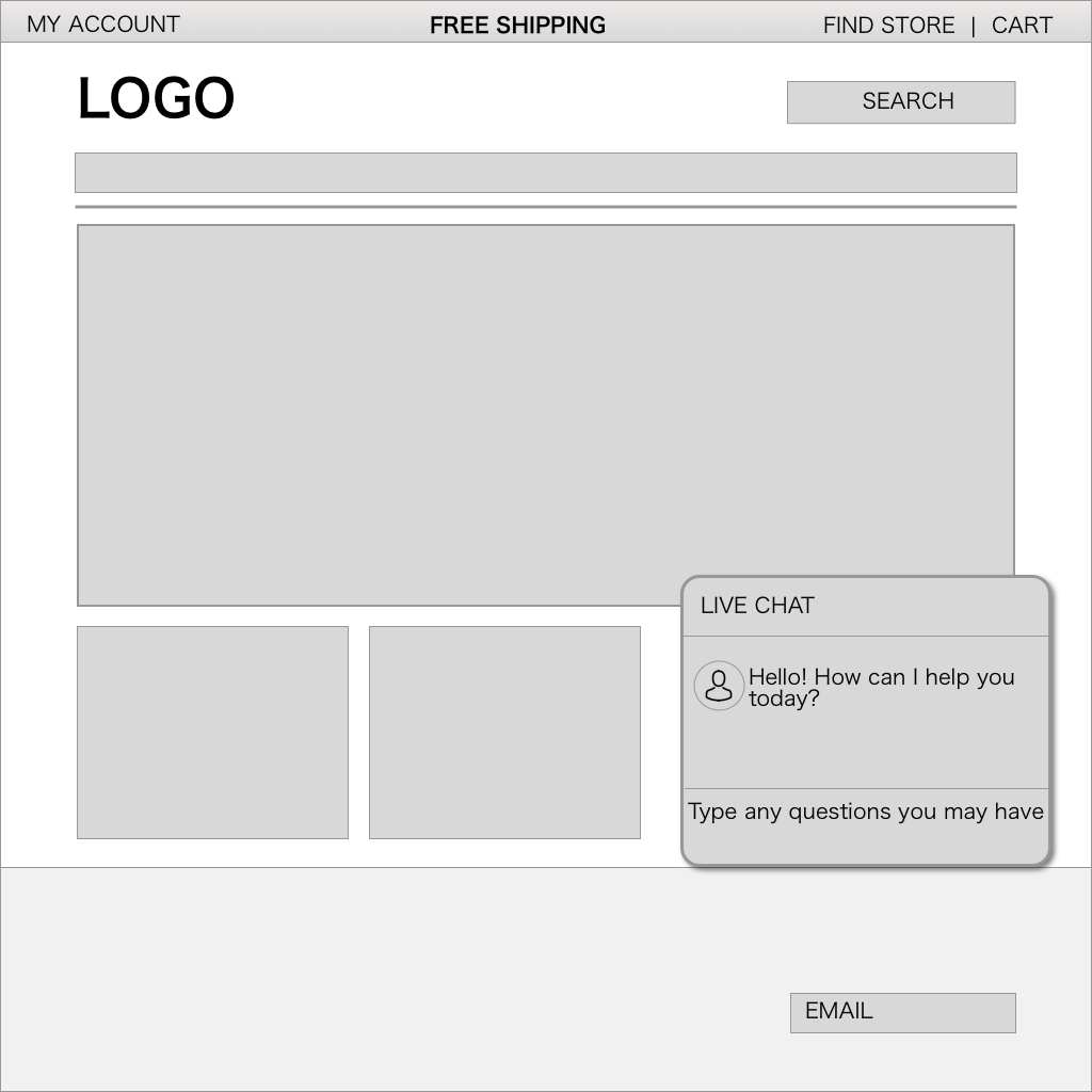
Version 1
Based on our first feedback, we needed to
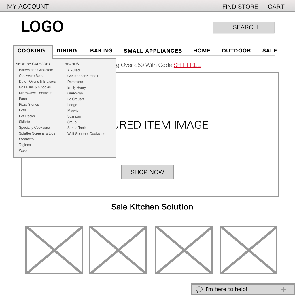
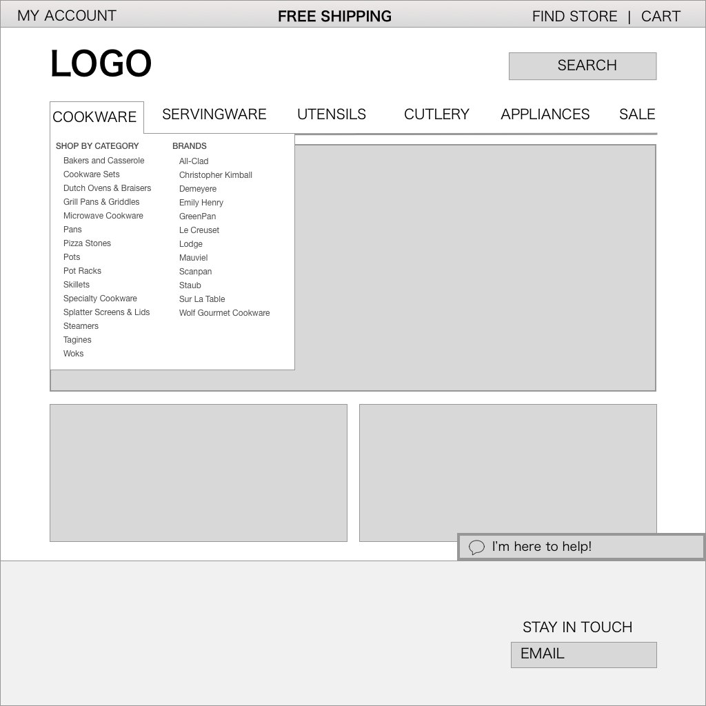
Reorganized the categories to be more explicit. User were selecting the wrong category link when looking for certain items. We needed to do a comprehensive card sorting exercise to find the proper way to organized the IA
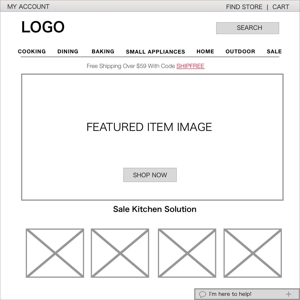
“Free Shipping” Banner needs to be more visible by increasing font size and bold colors
Chat needed to be smaller to not fully block visual
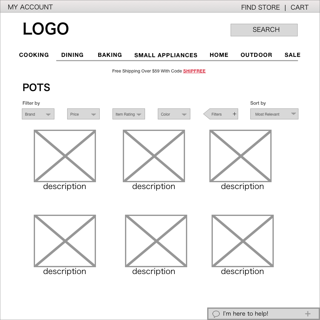
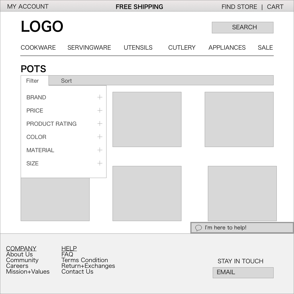
Filter and sort need a little bit more of redesign to make it easier for the user. Sur La Table had its original filter screen on the left side, and the filter feature list was extensive, so user needed to scroll down to review it all and by having the filter options in all one list we are repeating what we were trying to avoid.
Version 2
My second usability test feedback were more focused on the UI.
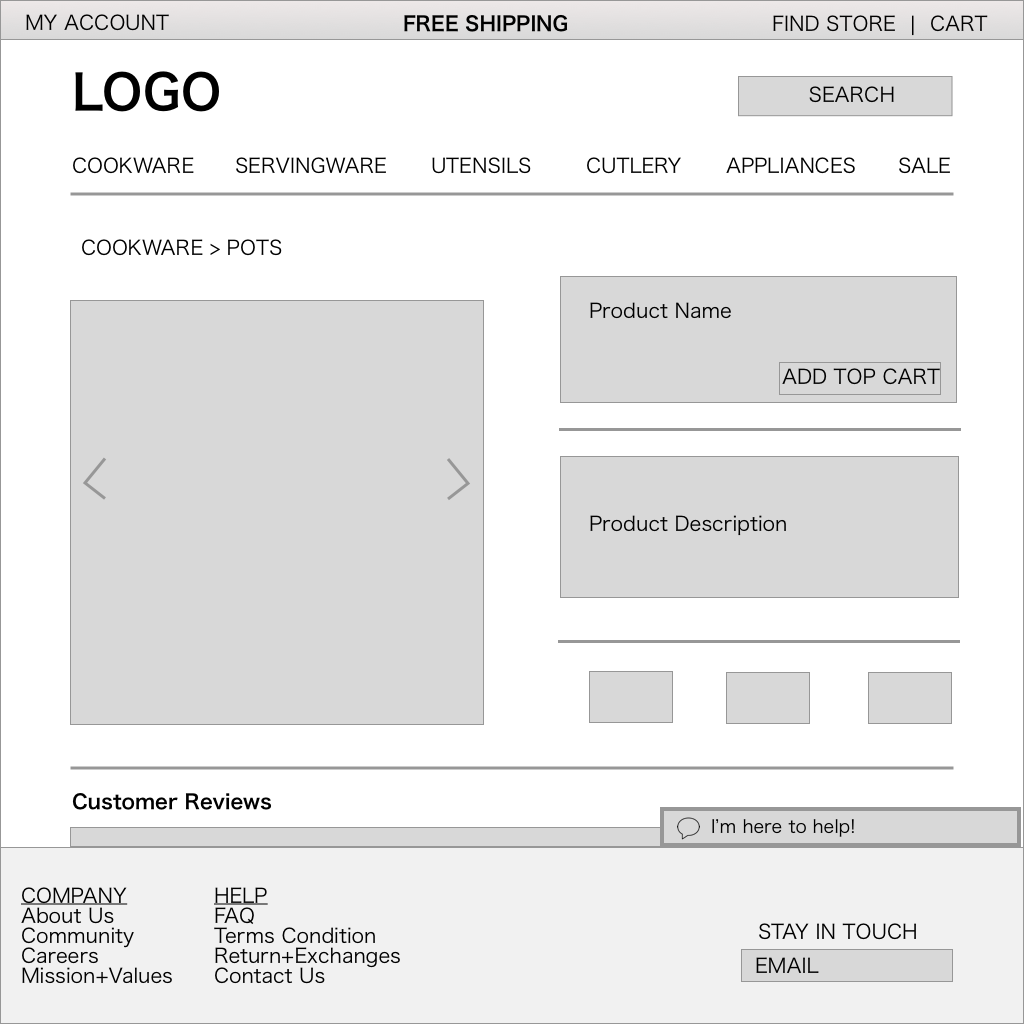
Chat box needs to be smaller
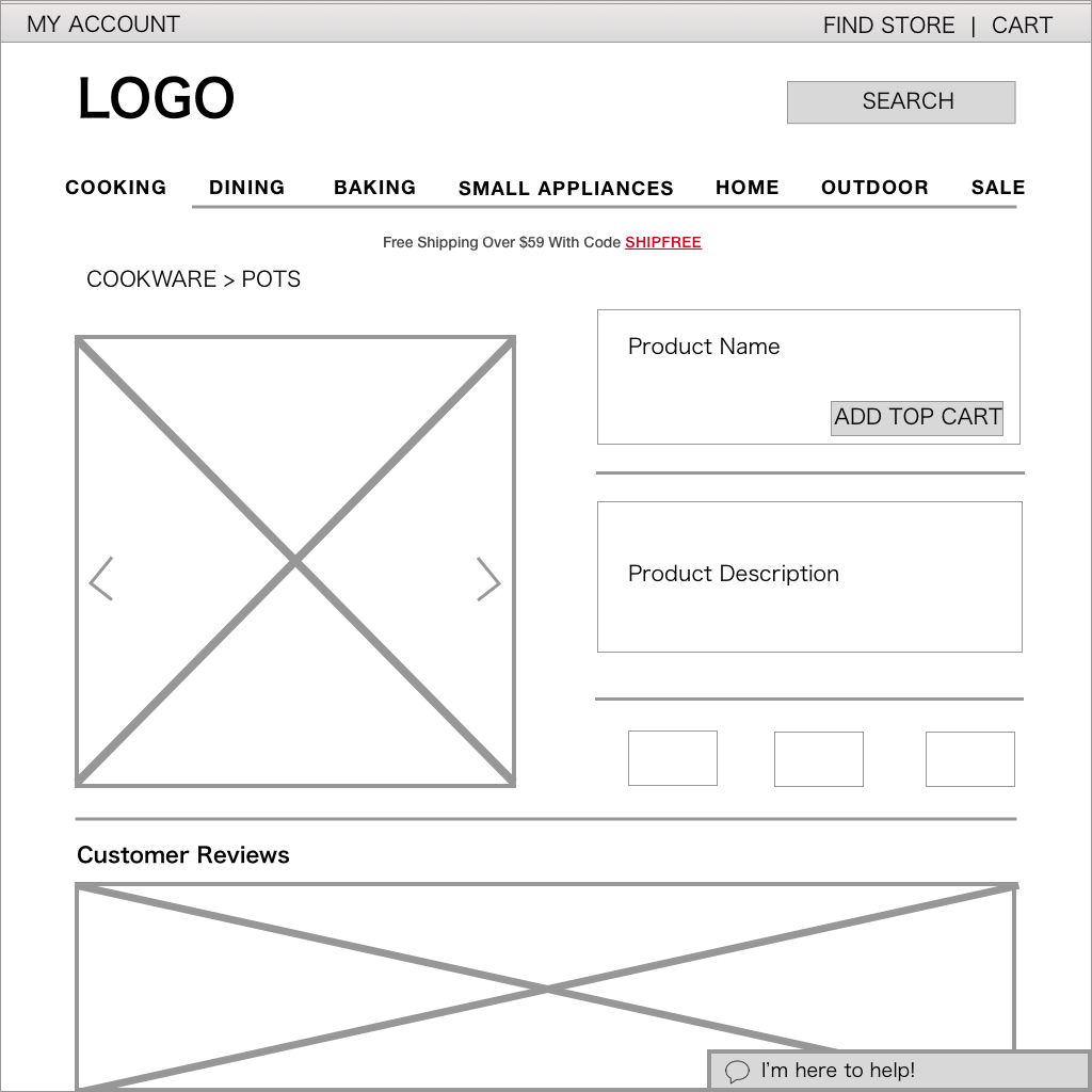
Also need to incorporate item in store availability as one of the main in the filter